19 Open-source Self-hosted Free Data Dashboard For Business Intelligence


What is a Data Dashboard
A data dashboard for business intelligence is a powerful tool that enables organizations to make sense of their data and gain valuable insights. It provides a visual representation of key metrics, trends, and performance indicators, allowing users to monitor and analyze data in real-time.
Benefits for Business Intelligence
Here are the benefits of using a data dashboard for business intelligence:
1- Visualize Data
Data dashboards present data in a visual and interactive format, making it easier to understand complex information. Users can create charts, graphs, and other visualizations to represent data in a meaningful way.
2- Make Informed Decisions
With a data dashboard, decision-makers can access accurate and up-to-date information. They can quickly identify trends, patterns, and anomalies, enabling them to make informed decisions based on data-driven insights.
3- Monitor Performance
Data dashboards provide real-time monitoring of key performance indicators (KPIs). Users can track metrics such as sales, revenue, customer satisfaction, and more, to assess the performance of their business or specific projects.
4- Collaborate and Share
Data dashboards promote collaboration within teams by providing a centralized platform for sharing and discussing data. Users can collaborate on dashboards, share insights, and annotate visualizations, fostering a data-driven culture within the organization.
5- Identify Opportunities and Risks
By analyzing data on a dashboard, users can identify potential opportunities for growth and areas of improvement. They can also spot potential risks or issues early on, allowing for proactive decision-making and problem-solving.
6- Track Goals and Progress
A data dashboard helps organizations track progress towards their goals. Users can set targets, monitor progress, and compare actual performance against set benchmarks, ensuring alignment with strategic objectives.
7- Enhance Data Literacy
Data dashboards promote data literacy within organizations. They provide a user-friendly interface that empowers users of all levels to interact with data, explore insights, and develop a deeper understanding of the organization's performance.
Roles Benefiting from Data Dashboards and Insights in an Organization
Data dashboards and data insights are beneficial for various roles within an organization, including:
1- Business analysts
They can leverage data dashboards to analyze and interpret data, identify trends, and generate insights to support strategic decision-making.
2- Business developers
Data dashboards enable them to monitor market trends, customer behavior, and opportunities for growth, helping them develop effective strategies to drive business growth.
3- Data analysts
They can use data dashboards to perform in-depth analysis, extract insights, and generate reports to support data-driven decision-making.
4- Sales teams
Data dashboards allow them to track customer interactions, manage leads, and improve sales forecasting, enhancing sales productivity and helping them effectively manage customer relationships.
5- Marketing professionals
Data dashboards provide access to customer data, enabling them to personalize marketing campaigns, target specific customer segments, and measure the effectiveness of their marketing efforts.
6- Decision-makers
Data dashboards empower decision-makers to access accurate and up-to-date information, monitor key performance indicators, and make informed decisions based on data-driven insights.
By utilizing data dashboards and gaining data insights, these roles can enhance their understanding of the organization's performance, identify opportunities and risks, track progress towards goals, and ultimately make data-driven decisions to drive business success.
In summary, a data dashboard for business intelligence is a valuable tool that enables organizations to gain insights, make data-driven decisions, collaborate effectively, and monitor performance. It helps organizations unlock the full potential of their data and drive continuous improvement and growth.
In the following list, you will find the best open-source solution that can serve as an informative self-hosted dashboard for gaining insights directly from your data.
1- Panel
Recommended for Data analysis, Data engineers
Panel is a powerful app and dashboarding solution for Python. It empowers you to effortlessly create interactive web applications and dashboards from your Python code, even if you don't have in-depth web development expertise.
Panel offers a range of versatile and adaptable components that empower you to construct dynamic and interactive data panels with confidence.
Panel makes it easy to combine widgets, plots, tables and other viewable Python objects into custom analysis tools, applications, and dashboards.
Panel provides a unique combination of deployment options. You can share your data and models as
- a web application running on the Tornado (default), Flask, Django or Fast API web server.
- a stand alone client side application powered by Pyodide or PyScript via
panel convert. - an interactive Jupyter notebook component.
- a static
.htmlweb page, a.gifvideo, a.pngimage and more.
Panel seamlessly works with popular visualization tools such as Altair/Vega, Bokeh, Datashader, Deck.gl/pydeck, Echarts/pyecharts, Folium, HoloViews, hvPlot, plotnine, Matplotlib, Plotly, PyVista/VTK, Seaborn, and more. Additionally, Panel is compatible with the ipywidgets ecosystem.
 holoviz
2- bs4Dash (R)
bs4Dash is an R package that provides a powerful and flexible framework for creating interactive dashboards in R. It is built on top of the popular Bootstrap 4 framework and offers a wide range of components and features for designing and customizing dashboards. With bs4Dash, you can easily create interactive and visually appealing dashboards for data visualization and analysis in R.
RinteRface3- Customizable Crypto Currency Dashboard with Chart 💹
This is a customizable cryptocurrency dashboard with charts. It is a project that allows users to view and analyze cryptocurrency data in a visually appealing and interactive manner.
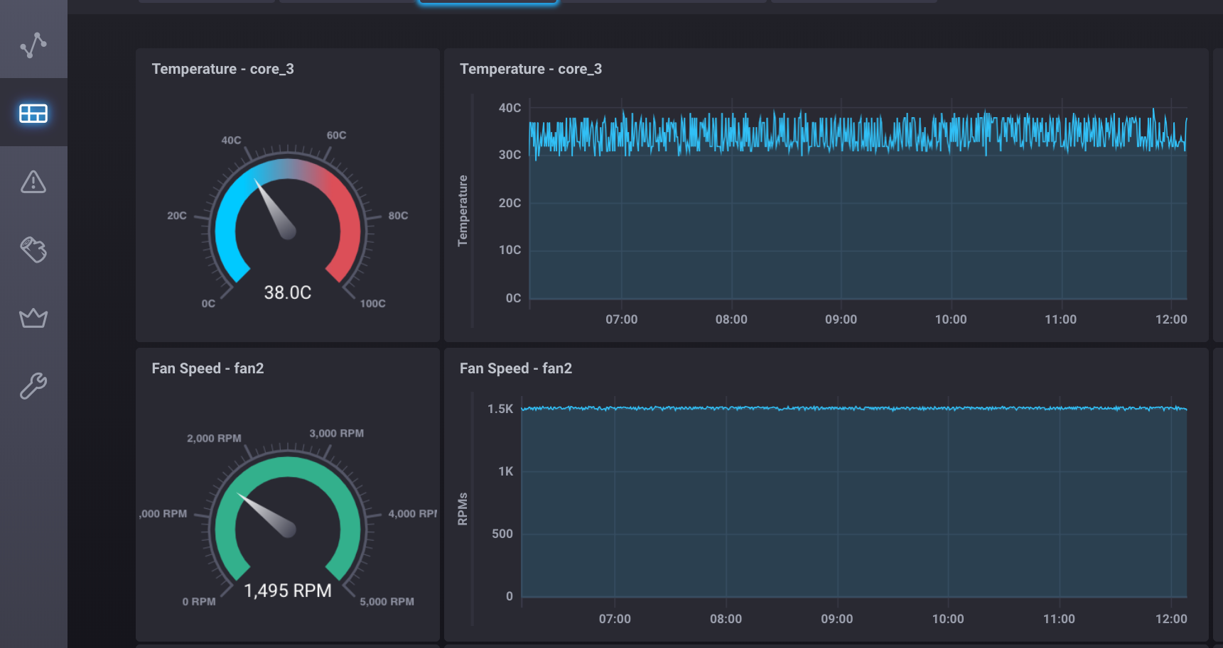
AYIDouble4- Grafana
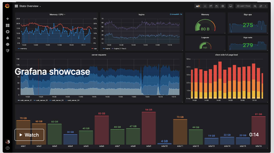
Grafana is an open-source analytics and monitoring platform that offers various use-cases and benefits for data analysis.
Grafana use-cases
Some of the use-cases of Grafana include:
- Visualizing and analyzing metrics: Grafana allows you to connect to various data sources and visualize metrics in the form of graphs, charts, and dashboards. This helps in monitoring and analyzing performance metrics, system health, and other key indicators.
- Monitoring infrastructure and services: Grafana can be used to monitor the performance and availability of infrastructure components such as servers, databases, and networking devices. It provides real-time insights into system health and helps in identifying and resolving issues promptly.
- Analyzing log data: Grafana integrates with log management systems and enables the analysis of log data. It helps in identifying patterns, anomalies, and trends in log files, which can be valuable for troubleshooting and optimizing system performance.
- Creating custom data visualizations: Grafana offers a wide range of visualization options and customization features. Users can create interactive and visually appealing dashboards to represent data in a meaningful way, making it easier to understand and derive insights.
- Collaborative data analysis: Grafana allows users to share dashboards and visualizations with team members, enabling collaborative data analysis and decision-making.
Tools built with Grafana
Some tools built with Grafana include:
- Grafana Loki: A log aggregation system that works seamlessly with Grafana for log data analysis and visualization.
- Grafana Tempo: A distributed tracing system that provides observability into the performance of distributed systems.
- Grafana Tanka: A configuration utility that allows users to manage Grafana dashboards and other resources as code.
Grafana for Data Anslysis
The benefits of using Grafana for data analysis include:
- Flexibility: Grafana supports a wide range of data sources, making it adaptable to different data analysis requirements. It can connect to databases, cloud services, IoT devices, and more.
- Visualization capabilities: Grafana offers a rich set of visualization options, allowing users to create visually appealing and informative dashboards and graphs.
- Extensibility: Grafana can be extended with plugins and integrations, enabling users to incorporate additional functionalities and data sources into their analysis workflows.
- Community support: Grafana has a large and active community of users and developers who contribute to its development and provide support. This ensures access to a wealth of resources, documentation, and community-driven plugins.
- Open-source and free: Grafana is an open-source project, which means it is free to use and can be customized to meet specific needs without any licensing costs.
Overall, Grafana is a powerful tool for data analysis, offering a range of features, integrations, and customization options that make it valuable for monitoring, visualization, and exploration of data.
grafana5- Emoncms
Emoncms, an open-source web application used for processing, logging, and visualizing energy, temperature, and other environmental data. Emoncms is a part of the OpenEnergyMonitor project, which aims to provide tools and resources for monitoring and managing energy consumption.
emoncms6- Seal Report & ETL
Seal Report is an open-source reporting tool for .NET. It enables users to create and customize reports based on various data sources such as databases, Excel files, CSV files, and more.
Seal Report provides a user-friendly interface and a wide range of features for designing, scheduling, and exporting reports in different formats. With its intuitive drag-and-drop interface and powerful functionalities, Seal Report simplifies the process of creating and sharing reports for data analysis and business intelligence purposes.
ariacom7- Dwata
No-code SQL Visualizer and SQL Data Panel
Dwata is a cool open-source web app that lets you explore and visualize SQL databases. It's got a user-friendly interface that makes it super easy to query databases, check out table relationships, and create interactive visualizations and reports. Dwata's all about making data exploration and analysis in SQL databases a breeze. 🚀
brainless8- Chronograf Dashboards
This project provides Chronograf dashboards for monitoring system environment health, compute performance, network interface performance, and NGiNX connections using data from Telegraf input plugins and InfluxDB.
robcowart9- Redash (Recommended)
Recommended for MySQL and PostgreSQL
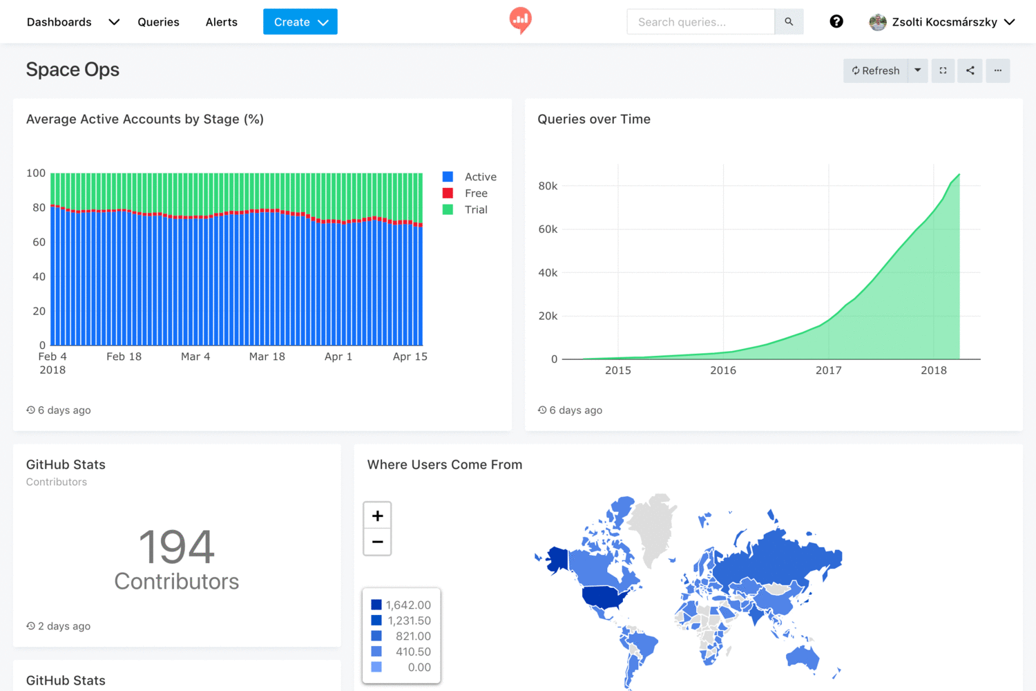
Redash is an open-source tool for data visualization and exploration. It provides a user-friendly interface for querying, analyzing, and visualizing data from various sources. Redash supports connecting to different databases, such as PostgreSQL, MySQL, and Elasticsearch, among others.
With Redash, users can create interactive dashboards, build custom visualizations, and share their findings with others. It offers a wide range of visualization options, including charts, graphs, and maps, allowing users to present their data in a visually appealing and informative way.
Moreover, Redash supports collaboration and sharing within teams. Users can collaborate on queries, share dashboards, and set up alerts to stay informed about important changes in the data.
Overall, Redash is a powerful tool for data exploration and visualization, enabling users to gain insights and make data-driven decisions.
getredash10- Hystrix Dashboard
The Hystrix Dashboard is an essential tool for effectively monitoring applications that utilize the Hystrix library. With its user-friendly interface and powerful features, it provides real-time insights into the performance and health of your applications.
By utilizing the Hystrix Dashboard, you can easily track and analyze various metrics related to the execution of your application's commands. This includes information about the success rate, latency, and concurrency of each command, allowing you to identify potential bottlenecks and performance issues.
In addition to monitoring individual commands, the Hystrix Dashboard also provides an overview of the overall health of your application. It enables you to visualize the circuit breaker states, thread pool utilization, and error rates, giving you a comprehensive understanding of the system's behavior.
Moreover, the Hystrix Dashboard integrates seamlessly with other monitoring and alerting tools, allowing you to create custom dashboards and set up notifications based on specific thresholds or conditions. This ensures that you are always aware of any critical changes or anomalies in your application's performance.
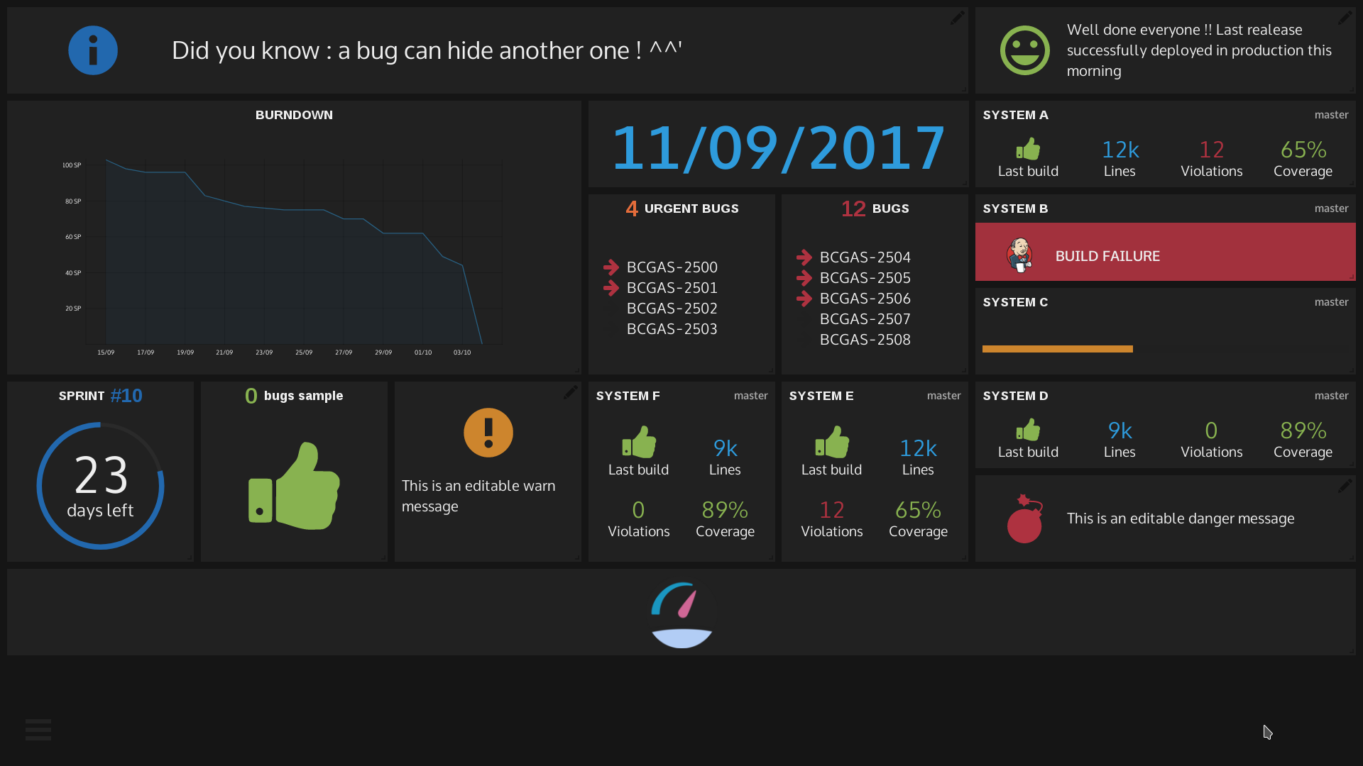
Netflix-Skunkworks11- Mozaïk
Mozaik is an incredibly powerful open-source tool for building stunning dashboards. It is meticulously designed to deliver a seamless and highly customizable experience for visualizing data.
Mozaik boasts a wide range of widgets and data sources, empowering users to effortlessly create dynamic and interactive dashboards that are perfectly tailored to their unique requirements.
With its intuitive interface and extensive array of customization options, Mozaik stands as the top choice for developers and data analysts seeking to craft breathtaking dashboards for the purpose of data visualization and monitoring.
plouc12- awe: reports/dashboards
awe is a free and open-source dynamic web based report and dashboard written in Python.
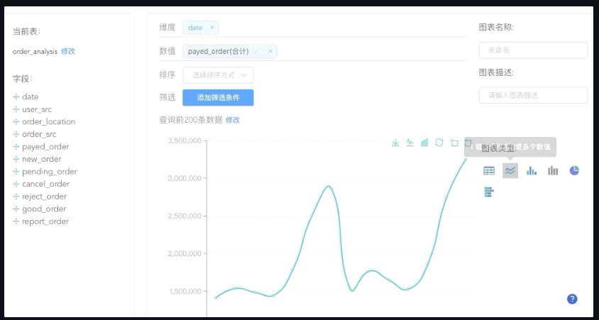
dankilman13- Metabase
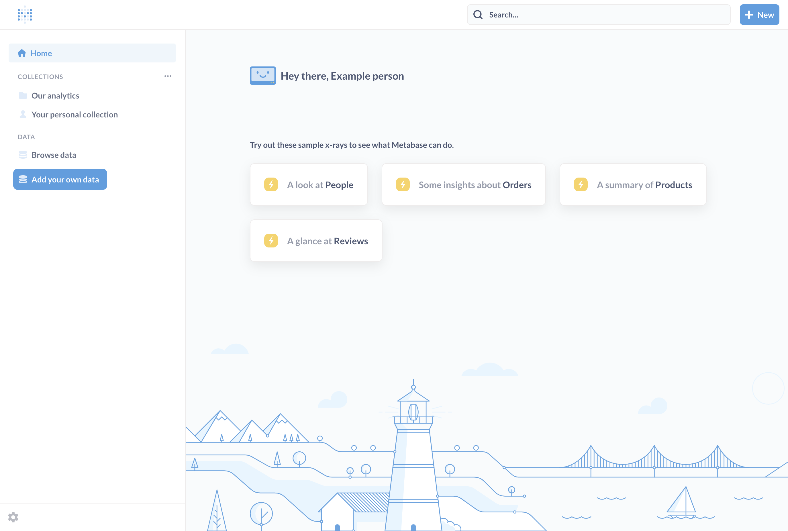
Metabase is a cool open-source tool for business intelligence and analytics. It's got a user-friendly interface that lets you explore, visualize, and analyze data from all sorts of places. You can create interactive dashboards, run queries on the fly, and make reports.
It works with tons of different data sources and has some awesome features like data filtering, charting, and sharing your dashboards. Best part is, you don't need to be a tech whiz to use it - it's super easy for anyone to get the hang of!
metabase14- ez-Dashing
ez-Dashing is an open-source web application that provides a simple and efficient solution for building customizable dashboards. It is built using Ruby on Rails and is inspired by the popular Dashing framework. With ez-Dashing, users can easily create and configure widgets to display various types of data, such as charts, graphs, and key performance indicators.
It offers a user-friendly interface and allows for easy customization, making it a great choice for creating dynamic dashboards for data visualization and monitoring purposes.
ylacaute15- Turnilo
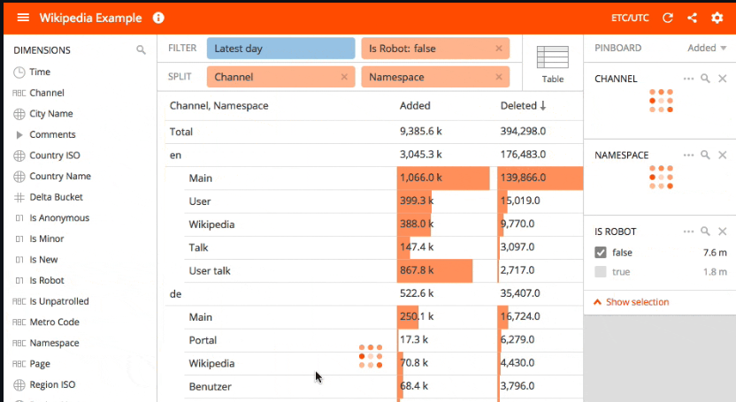
Turnilo is a cool web app for business intelligence, data exploration, and visualization that's made especially for Apache Druid. It's actually a fork of Pivot, but the thing is, Pivot is only available if you're willing to pay for it. So, the folks behind Turnilo took the stalled repository Swiv and added in the latest version of Pivot under the Apache license.
allegro16- Kibana
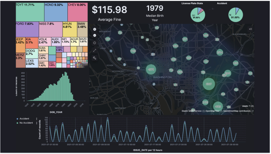
Kibana is an impressive open-source analytics and visualization platform specifically designed to seamlessly integrate with Elasticsearch. It boasts robust capabilities for effortlessly exploring, analyzing, and visually representing data that is stored in Elasticsearch.
With its intuitive interface, Kibana empowers users to effortlessly create personalized dashboards, visualizations, and reports, making it the go-to choice for professionals seeking to conduct thorough data analysis and monitoring within the Elasticsearch ecosystem. Notably, Kibana finds extensive application in log and event data analysis, application monitoring, and business intelligence ventures.
elastic17- Apache Superset
Apache Superset is an exceptional open-source business intelligence web application that empowers users to effortlessly explore and visualize data, create dynamic dashboards, and develop data-driven applications.
It offers a user-friendly interface for seamless data exploration and analysis, with extensive support for diverse data sources and visualization options. Superset is meticulously designed to be highly customizable and scalable, making it the perfect choice for data analysis and reporting, whether it's for small-scale projects or enterprise-level operations.
apache18- Vue-Data-Board
This is an incredible open-source Data Analysis Board. It is a powerful DIY databoard tool built with Vue.js. It provides an exceptional out-of-the-box solution for enterprise data analysis. It fully supports the creation of custom databoards and data reports.
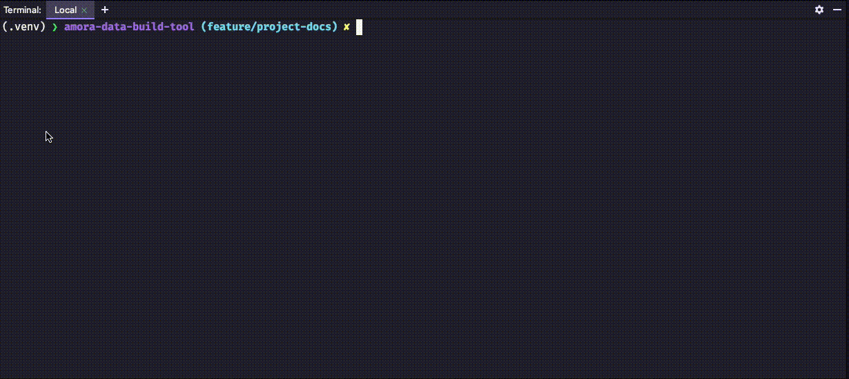
dongsuo19- Amora Data Build Tool
Amora Data Build Tool empowers analysts and engineers to efficiently manipulate data in the data warehouse (BigQuery) using Amora Models. These models define the data schema using Python's PEP484 - Type Hints and execute select statements with the help of SQLAlchemy. Amora seamlessly converts Python code into SQL data transformation jobs that run directly within the warehouse.

 mundipagg