A Quick Guide For Flutter TextField Widget


TextField widget is an essential widget for every Flutter developer. It is a simple basic widget, yet a powerful tool that allows many customization options, and useful functions.
In this post, we will explore a collection of TextField snippets and tricks.
1- Basic setup
The basic TextField setup looks like this: TextField() which will display a blank text field with the default setup. Next let's add a label.
2- Labels
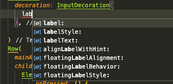
TextField labels are pretty straightforward, yet they are highly customized as well. The labels are part of the TextField decoration InputDecoration(). You can add the label, customize the label style, add and customize floating labels, and more.
3- Icons
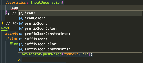
TextField widget offers you to add 3 different type of icons for your text field input: a basic icon, a prefixIcon which will be at the start of your Input, and a suffixIcon that will display at the end of your TextField input.
3- Text Direction: LTR and RTL
Text Direction is essential especially when your app will be or support RTL (Right-To-Left) languages like Arabic, Persian, and Hebrew.
Here is how to add your text direction to the TextField widget:
  TextField(
        textDirection: TextDirection.ltr,
        )
4- Password field
To add a password field you just need to obscure text as following
const TextField(
  obscureText: true,
  decoration: InputDecoration(
    border: OutlineInputBorder(),
    labelText: 'Password',
  ),
)
5- Prepopulate text
If you want to add a prepopulated text to your TextField input, you can simply use: initialValue
TextFormField(
  initialValue: "Initial Value String")
6- Multi-line support
Multiline support allows you to add a large text, with the TextField widget, you can simply set the max- and min-lines:
TextField(
              textDirection: TextDirection.ltr,
              maxLines: 10,
              decoration: InputDecoration()

         )
7- Decoration borders
TextField input borders can be tricky, but soon as you get a hold of it, it is pretty fun:
First to add and customize a simple input border, we use: OutlineInputBorder
 TextField(
              decoration: InputDecoration(
                  label: Text('Title'),
                  border: OutlineInputBorder(
                      borderRadius: BorderRadius.circular(20))),
            ),
You can set many border options as colors, style, and borderRadius.
To disable the borders you can simply use: InputBorder.none
TextField(
decoration: InputDecoration(
label: Text('Title'),
border: InputBorder.none
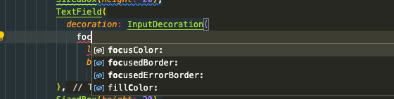
),8- Colors
Setting the input colors can be done from within decoration as well, you can simply add a fillColor, set iconColor, focusColor, hoverColor, and prefixIcon/ suffixIcon colors.
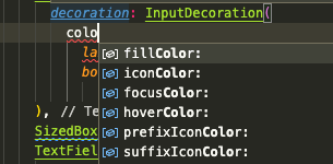
Do not forget fillColor is affected by your Theme Colors, which you can configure directly from your MaterialApp:
TextField(
  decoration: InputDecoration(
    filled: true,
    fillColor: Colors.blue,
  ),
),
Here How to set your Input Fills using ThemeData:
MaterialApp(
  title: 'Flutter Demo',
  theme: ThemeData(
    primarySwatch: Colors.red,
    inputDecorationTheme: const InputDecorationTheme(
        filled: true,
        fillColor: Colors.red,
        ),
  ),
  home: HomeScreen(),
);
9- Focus
Focus is a nice addition to add to your TextField input, it makes it live. You can also utilize to notify the user of an error.
10- Keyboards
Keyboards allows you to set the value type you wanna input using a specific keyboard: as numbers, text, datetime, phone, url, password, email address and more.
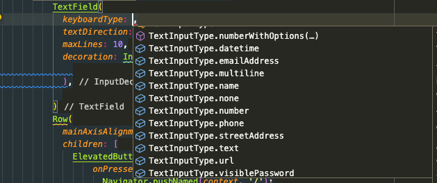
Here are the most useful keyboard types:
- TextInputType.number: Opens a numerical keyboard
- TextInputType.datetime: Provides a numerical keyboard optimized for date, and time
- TextInputType.multiline: supports multi-line text input
- TextInputType.emailAddress: a customized keyboard for email address with the "@" button.
- TextInputType.phone: A special keyboard for adding phone numbers
11- HintText (AKA Placeholder)
HitText is the Flutter TextField equivalent for HTML5 "Placeholder", you can add it like this:
 TextField(
      decoration: InputDecoration(hintText: "Type your name here ..."),)
You can also set a HintText direction using: hintTextDirection: TextDirection.rtl.
12- Getting the data
To get the TextField value, you will need to use a controller, here is a how:
First, you define your TextField controller:
final TextEditingController _title = TextEditingController();Then you add this controller to your TextField like:
            TextField(
              controller: _title,
              decoration: InputDecoration(
                  label: Text('Title'),
                  border: OutlineInputBorder(
                      borderRadius: BorderRadius.circular(20))),
            ),
The TextEditingController() enables you to retrieve your Text value, prepopulate your value and most importantly watch any update.
The TextField value can be retrieved like that in your functions, it provides you direct access to your TextEditingController methods:
_title.text13- Clear
To clear your input, after form submit as an example, simply access your controller's clear method:
void clearText() {
_title.clear();
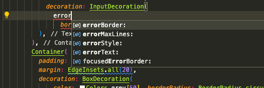
}14- Error
Error text enables you to attach an error message to your TextField:
15- Floating label
Floating label is a fancy-animated label effect that is activated as soon you start writing.
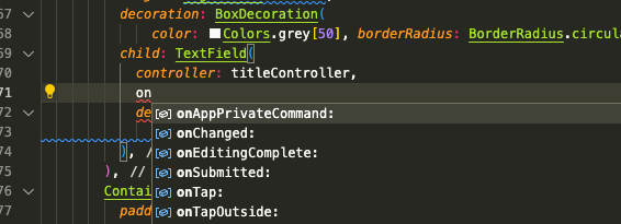
16- Callbacks
TextField widget comes with useful callback that can be used directly when required as: onChanged, onEditingComplete, onTap, onSubmitted, onAppPrivateCommand, and onTabOutside.
17- Autofocus
Allows you to set autofocus to your TextField widget as soon it's created:
TextField(
  autofocus: true,
),
18- Readonly
To make your TextField ready only: just add readOnly: true
child: TextField(
controller: titleController,
readOnly: true,
decoration: InputDecoration(
border: InputBorder.none, hintText: "title...."),
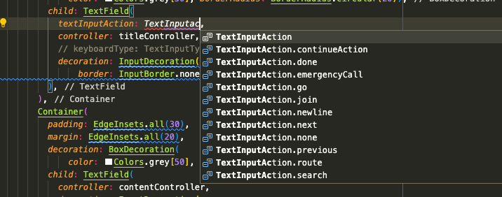
),19- TextInputAction
The TextInputAction option enables a custom action added to the keyboard. You may select the right one for your requirment:
20- Autocorrect
The Autocorrect is a handy feature, you can enable or disable it per field, as follows:
TextField(
	autocorrect: false,
    )