Centralizing a Fragmented React Vector Stack Using Off-the-Shelf Iconography

Managing a shared React component library for five distinct product teams usually feels like playing defense against vector sprawl. Unattended repositories quickly fill up with mismatched stroke weights and conflicting viewboxes. One squad imports a thick outlined user profile graphic for their dashboard. Another team commits a solid filled bell notification for a mobile view. Soon enough, your interface looks like a patchwork quilt assembled by strangers.
Visual inconsistencies become glaringly obvious within the first few sprints. Keeping a unified aesthetic across products without building every set in-house requires careful balance. Asking a dedicated illustration team to draw every single symbol creates a severe bottleneck for frontend velocity. Relying on random Google searches builds an unmaintainable mess over time.
Icons8 offers a highly practical middle ground. You get a massive asset library grouped by strict visual guidelines. That changes everything.
A Thursday Afternoon Authentication Request
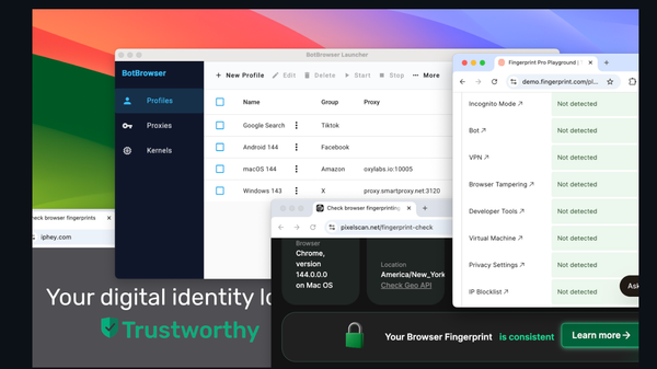
Picture a late Thursday afternoon code review. Our authentication squad just submitted a pull request for a new single sign-on modal. They need specific brand graphics for third-party integrations alongside standard interface symbols. Previously, we hunted through three different open source repositories to find these disparate parts. Someone then manually adjusted the XML of each vector file to force visual alignment.
Skip that manual busywork. I open the Icons8 Pichon macOS desktop app directly. Filtering my search isolates assets strictly to our currently approved style pack. Finding a crisp apple logo takes literally two seconds. Grabbing the necessary email and password symbols is just as fast. Because everything comes from an identical iOS 17 Glyph category, they share exact baseline padding and scaling behavior. Dragging those SVGs straight into our VS Code workspace takes moments. Thirty minutes later, that pull request merges with zero visual discrepancies.
Constructing the Base Component Architecture
Building an easily consumable vector pipeline across multiple engineering groups requires strict organization. Dumping raw files into a repository? Total chaos. Establishing a single source of truth involves a highly specific workflow from start to finish.
Start by creating a master Collection inside the Icons8 web interface. Think of it as your ultimate staging ground. Whenever a product manager requests new feature screens, search the library for those specific parts. Add those required graphics straight into that central bucket.
Populating the collection is only step one. Next comes the bulk recolor tool. Inputting our primary brand HEX code updates every single graphic instantly right in your browser window.
Exporting these files feeds directly into our React architecture:
- Download the entire collection as individual SVG files
- Run those exports through SVGR to transform them into React components
- Map everything to a unified `<Icon />` wrapper component
- Expose a `name` and `size` prop for individual product teams to consume
Here's the magic behind that exact approach. When a frontend developer types `<Icon name="settings" size={24} />`, they receive an asset perfectly matching the stroke and padding of `<Icon name="user" size={24} />`. Teams never interact with raw XML paths. No guesswork required.
Bridging Platform-Specific Interface Guidelines
Supporting multiple products inevitably means juggling divergent platform requirements. Our company includes a web-based administration dashboard squad alongside a native mobile companion app crew. Forcing a single aesthetic across both platforms usually violates native user experience guidelines.
Categorizing over 45 distinct visual styles solves that exact problem. Many of these individual packs contain well over 10,000 icons each.
Take the web dashboard team. We hand them the Material Outlined pack. When they ask for a calendar symbol, they get a standard Google-compliant aesthetic. Mobile developers building an iOS wrapper need something else entirely. Switching the global filter to the Apple-compliant iOS 17 style fixes it instantly. Semantic search terms remain exactly the same. Downloading a platform-appropriate version takes a single click. Adding it to that specific team's sub-collection keeps the repository organized. Both squads get native-feeling visuals without requiring expensive custom design cycles.
Evaluating the Asset Marketplace Ecosystem
Engineering teams establishing a vector strategy generally face three choices. You've got free repositories, asset aggregators, or custom generation.
Open source packs like Feather or Heroicons shine in side projects. Beautifully designed files cost absolutely nothing. Scale becomes their primary weakness. Having only a few hundred graphics available means you'll inevitably hit a wall. Product managers eventually request highly specific concepts like a blood pressure monitor or a rare database architecture symbol. Commissioning a custom graphic just breaks your perfectly uniform system.
Aggregators like The Noun Project offer massive scale without visual cohesion. Pooling submissions from thousands of independent creators creates massive friction. Searching for five different interface elements yields five totally different visual weights. Placing them side by side in a navigation bar looks incredibly jarring.
Finding a sweet spot between these extremes matters. In-house designers at Icons8 build out massive specific style packs deliberately. They'll guarantee that asset number 10,000 perfectly matches asset number one. Combining the scale of an aggregator with strict open-source guidelines simply works.
Boundaries of the External Asset Pipeline
Relying on a third-party platform for core interface elements introduces strict operational limits. Immediate roadblocks await any serious development team testing the free tier structure. Free access caps at 100px PNG files and requires visible attribution links. Raster graphics at that resolution fail completely in crisp, responsive React applications. Committing to a paid plan isn't optional if you need scalable vector formats.
Moving beyond static graphics introduces serious technical complexity. Animated libraries with GIF and Lottie JSON formats exist on the platform. Integrating these into a strict React component library requires completely different handling than standard SVGs. Stacks that aren't already configured to parse Lottie JSON files face a steep configuration curve to support dynamic graphics.
Adding strokes or textual overlays via the in-browser editor generates complex SVG paths. Components relying on CSS-based path manipulation for hover states suffer here. Modified assets often require tedious manual code cleanup after downloading.
Optimizing the Vector Workflow
Managing thousands of assets across a large engineering team requires serious discipline. Maintaining this pipeline taught me exactly what keeps a repository clean over time.
Check your download settings closely. Verify the state of the "Simplified SVG" toggle before exporting anything. Leaving that box checked reduces your final bundle size by stripping unnecessary XML cruft. Uncheck that option only when your frontend team specifically needs to target individual vector paths with CSS keyframe animations.
Prototyping rapid dashboard layouts doesn't require downloading physical files. Skip that step entirely. Export a Base64 HTML fragment directly from the web interface. Pasting that string straight into an image source tag in your React component validates the layout instantly. Doing this saves you from committing temporary visual experiments to your pristine repository.
Look at the background padding tools within the web editor before exporting. Ensure every asset shares identical internal padding before hitting your codebase. Aligning files perfectly prevents developers from writing localized CSS margins just to fix a stray graphic in a flex container.