Top 8 Open-Source Design Systems for Enterprises and Startups

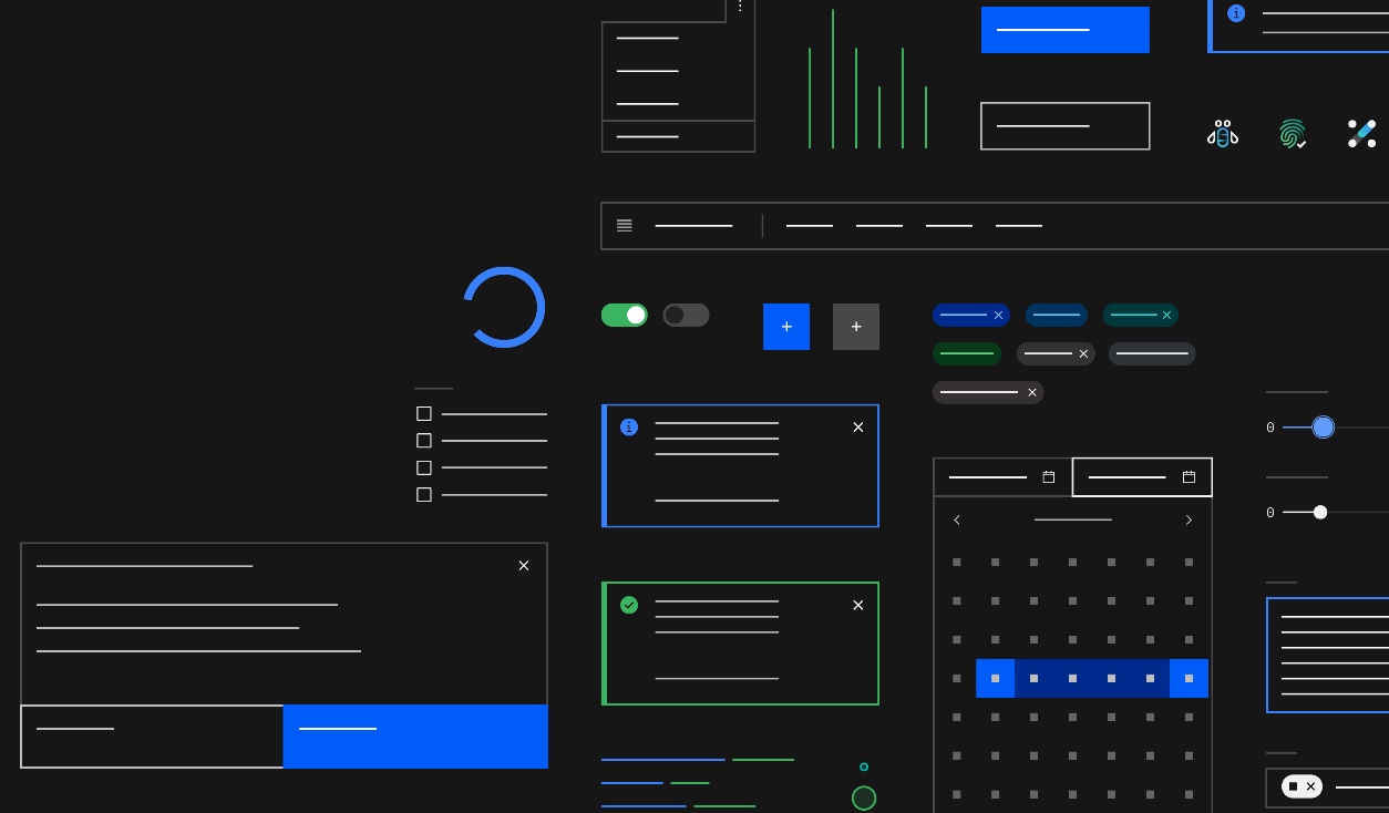
Table of Content
What is a Design Systems?
A design system is a comprehensive set of standards, guidelines, components, and tools used to create a consistent visual and user experience across a product or a suite of products.
It serves as a single source of truth for designers, developers, and other stakeholders involved in the creation and maintenance of digital products.
Key Components of a Design System:
- Design Principles: Core philosophies that guide the design decisions, ensuring that all components and layouts adhere to the same overarching goals and values.
- Style Guide: A collection of rules and visual guidelines for elements like typography, color palettes, iconography, spacing, and imagery. It defines how these elements should be used to maintain consistency.
- UI Components: Reusable user interface components such as buttons, forms, modals, navigation bars, and cards. These components are designed to be used across various parts of a product to ensure a uniform look and feel.
- Component Library: A coded library where the UI components are stored, usually in a format that can be easily integrated into a development environment. This library allows developers to quickly implement design elements without recreating them from scratch.
- Patterns and Templates: Predefined combinations of components and layouts that address common design challenges, such as sign-up forms, dashboards, or content displays. These patterns help streamline the design process by providing proven solutions.
- Documentation: Detailed instructions and guidelines on how to use the design system, including examples, best practices, and explanations of the rationale behind design decisions.
Benefits of a Design System:
- Consistency: Ensures a unified look and feel across all products and platforms.
- Efficiency: Speeds up the design and development process by providing ready-to-use components and guidelines.
- Scalability: Makes it easier to scale products by maintaining consistency across new features or platforms.
- Collaboration: Facilitates collaboration between designers, developers, and other stakeholders by providing a shared language and resources.
A well-established design system not only improves the quality and coherence of digital products but also fosters efficiency and innovation within the design and development teams.
1- Google Material Design
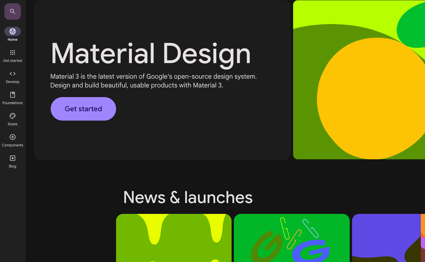
Material Design is originally created by Google and it is highly popular for mobile applications, especially in Android development. It is also widely used in web development.
Features
- Consistent UI/UX: Material Design ensures a uniform and intuitive experience across different devices, with standardized elements like buttons, icons, and animations.
- Responsive Design: It adapts to various screen sizes, making it ideal for mobile, tablet, and desktop.
- Motion and Interaction: Emphasizes meaningful motion to guide users, providing a more engaging experience.
- Material Theming: Allows customization of the design system to match brand identity while maintaining consistency.
- Comprehensive Guidelines: Extensive documentation helps developers and designers implement Material Design correctly.
Material Design Frameworks
Some popular frameworks that implement Material Design include:
- Material-UI (React): A React-based framework for building Material Design components.
- Angular Material: A set of reusable UI components for Angular.
- Vuetify: A Material Design component framework for Vue.js.
- Flutter: Google’s UI toolkit that uses Material Design by default for both Android and iOS.
2- IBM Carbon
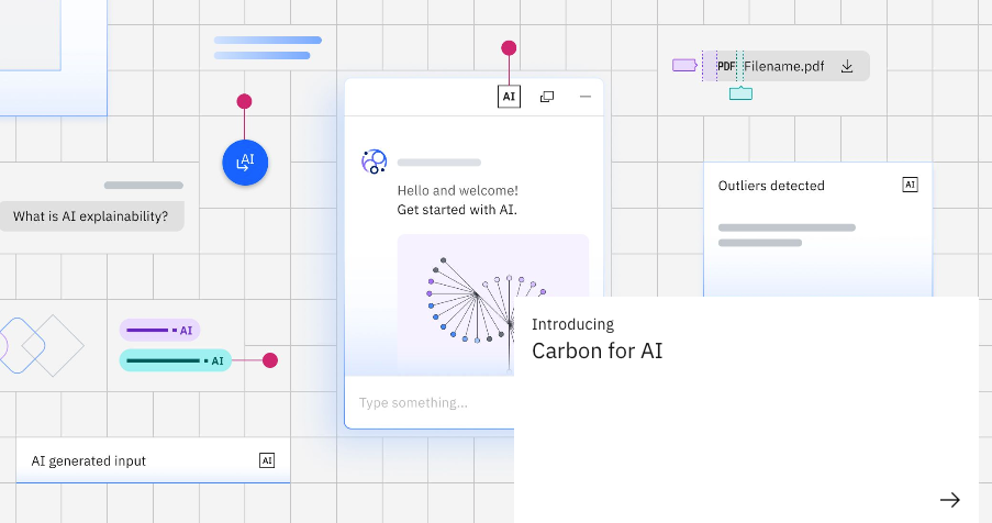
Carbon is IBM's design system tailored for web and product development, offering a cohesive approach to creating consistent and visually appealing user interfaces. It comprises a collection of individual styles, components, and guidelines that ensure a unified look and feel across IBM's digital products.
As a free and open-source design system, Carbon is built upon the IBM Design Language and is licensed under the Apache License 2.0.
Since its public launch on June 10, 2015, Carbon has been instrumental in helping designers and developers craft seamless and standardized UI experiences.
Features
- Comprehensive Component Library: Carbon offers a wide range of pre-built UI components, including buttons, forms, tables, and navigation elements, designed to ensure consistency and usability across applications.
- Theming and Customization: Carbon allows for easy customization of themes to align with brand identity, enabling developers to adapt the design system to specific project needs while maintaining a cohesive look.
- Accessibility: Built with accessibility in mind, Carbon ensures that all components meet or exceed WCAG guidelines, making it easier to create inclusive and user-friendly interfaces.
- Responsive Design: The system is optimized for responsiveness, ensuring that applications look and perform well on a variety of devices and screen sizes, from mobile to desktop.
- Extensive Documentation: Carbon provides thorough documentation and guidelines, offering step-by-step instructions, code snippets, and design principles to help teams implement the system effectively.
- Design Tokens: Carbon uses design tokens to store design-related attributes such as colors, spacing, and typography, enabling consistent application across all platforms.
- Support for Multiple Frameworks: Carbon is compatible with several front-end frameworks, including React, Angular, and Vue, making it versatile for various development environments.
- Open Source Community: As an open-source project, Carbon benefits from contributions and enhancements from a global community, ensuring continuous improvement and innovation.
- Motion and Interaction Guidelines: Carbon includes motion guidelines to help designers and developers create fluid and intuitive user interactions, enhancing the overall user experience.
Frameworks that uses Carbon Design System
- Carbon React (carbon-components-react): A React implementation of the Carbon Design System, providing a comprehensive set of React components that follow Carbon's guidelines and design principles.
- Carbon Angular (carbon-components-angular): This is the Angular version of the Carbon Design System, offering UI components tailored for Angular applications.
- Carbon Vue (carbon-components-vue): A Vue.js implementation of Carbon, providing Vue components that integrate seamlessly with Carbon's design language.
- Carbon Svelte (carbon-components-svelte): A Svelte implementation that brings Carbon Design System components to Svelte applications, allowing for lightweight and reactive UI development.
- Carbon for IBM Cloud (carbon-addons-cloud-react): A React addon for the Carbon Design System, specifically tailored for IBM Cloud services, providing additional components and styles to align with the IBM Cloud design language.
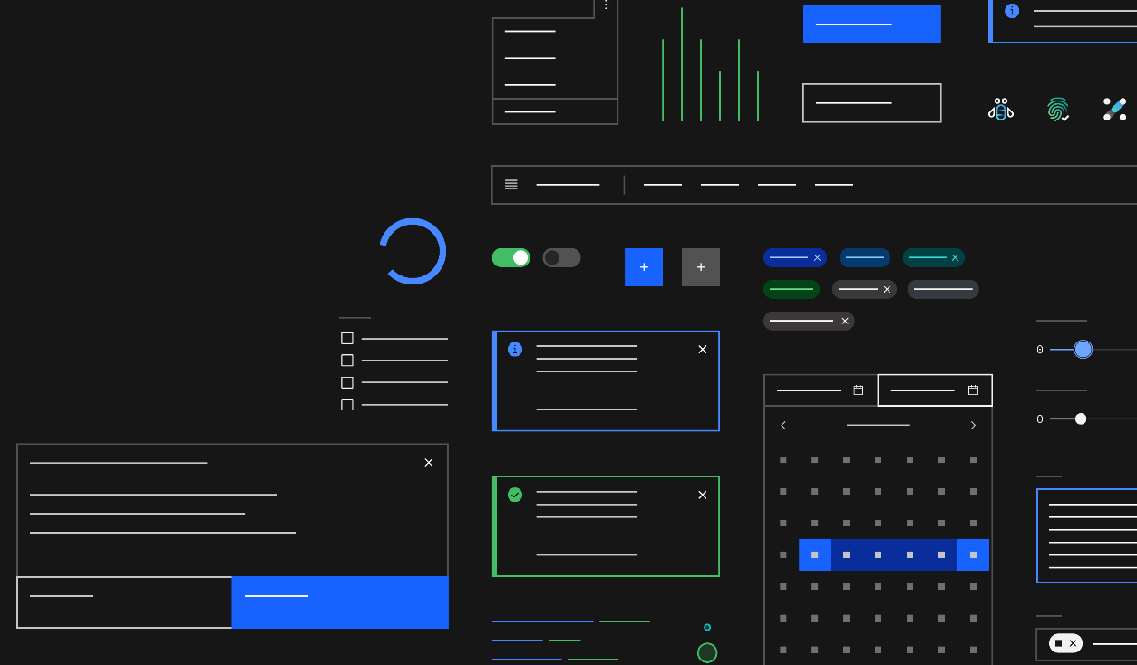
3- Polaris from Shopify
Shopify Polaris is a powerful tool for developers and designers working within the Shopify ecosystem. It streamlines the design process, ensuring that apps are not only visually consistent but also accessible and user-friendly.
Features of Shopify Polaris
- Extensive Component Library: Polaris offers a wide range of pre-designed components, such as buttons, forms, navigation, and typography, allowing for quick and consistent UI development.
- Guidelines and Best Practices: Polaris includes detailed guidelines on design principles, accessibility, and content strategy, helping developers create user-centric and accessible e-commerce experiences.
- Customization and Theming: Polaris supports easy customization, enabling developers to align their apps with specific brand identities while maintaining consistency with Shopify’s design language.
- Responsive Design: The system is built with responsiveness in mind, ensuring that all components look and perform well across different devices and screen sizes.
- Accessibility Focus: Polaris components are designed to meet accessibility standards, ensuring that Shopify apps are usable by all merchants, regardless of their abilities.
- Open Source: Shopify Polaris is open-source, allowing developers to contribute to its growth and adapt it to their specific needs, fostering a collaborative community around the design system.

4- Atlassian Design System
The Atlassian Design System is a robust framework designed to help teams create cohesive, user-friendly experiences across all Atlassian products. Tailored for startups and decision-makers looking to scale their digital offerings, this design system offers the tools and guidelines needed to maintain a consistent brand identity while fostering innovation.
For startups and decision-makers aiming to build scalable, user-friendly products, the Atlassian Design System offers a reliable foundation. It not only accelerates development but also ensures consistency, accessibility, and brand alignment, making it an essential tool for high-impact teams. By adopting this system, companies can focus on innovation and growth, confident in the quality and coherence of their digital offerings.
Features
- Comprehensive UI Components: Atlassian provides a rich library of pre-built UI components, from buttons and forms to navigation elements and data visualizations. These components are designed to ensure a consistent user experience across all platforms, reducing development time and enhancing product quality.
- Scalability: Built with scalability in mind, the Atlassian Design System supports growing businesses as they expand their product offerings. It allows teams to easily add new features and products while maintaining a unified look and feel.
- Customization and Flexibility: The system is highly customizable, enabling startups to align the design with their unique brand identity while still adhering to best practices. This flexibility ensures that your products stand out while still benefiting from a proven design framework.
- Design and Development Alignment: Atlassian fosters seamless collaboration between designers and developers by providing clear guidelines, documentation, and resources. This alignment ensures that both teams work together efficiently, speeding up the product development cycle and reducing miscommunication.
- Accessibility and Inclusivity: Accessibility is a core focus of the Atlassian Design System. It provides tools and guidelines to ensure that all products are accessible to a diverse user base, helping companies reach a wider audience and adhere to global standards.
- Performance Optimization: The design system includes performance considerations, ensuring that all components are optimized for speed and responsiveness. This focus on performance is crucial for startups that need to deliver fast and reliable digital experiences to their users.
Frameworks and Tools
Here are some frameworks and tools that leverage the Atlassian Design System:
- AtlasKit: AtlasKit is Atlassian's official React UI component library built on top of the Atlassian Design System. It provides a comprehensive set of React components that align with Atlassian’s design principles, making it easy to create consistent and high-quality user interfaces.
- ADG3 (Atlassian Design Guidelines v3): This is the third version of Atlassian's design guidelines, which includes the design principles and components used across all Atlassian products. It serves as a framework for developers and designers working within the Atlassian ecosystem.
- Atlaskit Editor Core: A rich text editor framework built using the Atlassian Design System. It’s used internally across various Atlassian products, offering a consistent and customizable editing experience.
- Fabric: Atlassian's open-source implementation of its design system, providing reusable components and design assets that can be used across different platforms and applications, ensuring consistency in UI/UX design.
5- Microsoft Fluent 2
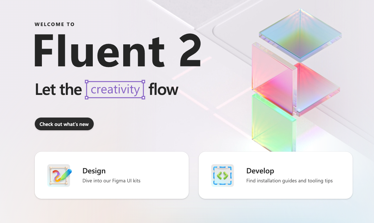
Fluent 2 is Microsoft's evolved design system, created to deliver modern, inclusive, and seamless user experiences across all Microsoft products.
Building on the success of the original Fluent Design System, Fluent 2 introduces refined aesthetics, enhanced accessibility, and greater flexibility, making it an ideal choice for developers and designers aiming to create cohesive and engaging digital products.
Fluent 2 is a robust design system that equips developers and designers with the tools to create modern, accessible, and consistent experiences across Microsoft products. By adopting Fluent 2, teams can ensure that their applications not only look and feel cohesive but also deliver high-performance, inclusive user experiences that resonate with a diverse audience.
Features
- Modern Aesthetics: Fluent 2 emphasizes a clean, minimalistic design with improved visual clarity, offering a fresh look that aligns with current design trends while maintaining familiarity with users.
- Cross-Platform Consistency: Fluent 2 ensures a consistent user experience across all Microsoft platforms, including Windows, web, and mobile, making it easier to create cohesive applications that feel native to the Microsoft ecosystem.
- Accessibility First: Fluent 2 is designed with accessibility at its core, providing tools and guidelines to create inclusive experiences for all users, including those with disabilities.
- Enhanced Customization: Fluent 2 offers greater flexibility in theming and customization, allowing developers to tailor the design system to specific brand identities and project requirements while maintaining a consistent user experience.
- Advanced Components: The design system includes a comprehensive library of UI components, such as buttons, forms, icons, and typography, all designed to be both functional and visually appealing.
- Performance Optimization: Fluent 2 components are optimized for performance, ensuring fast and responsive interactions across different devices and platforms.
- Fluid Motion: Incorporating smooth animations and transitions, Fluent 2 enhances user interactions by providing intuitive and responsive feedback, improving overall user engagement.
- Developer and Designer Collaboration: Fluent 2 facilitates seamless collaboration between developers and designers with extensive documentation, guidelines, and tools that streamline the design-to-development process.
6- DB UI Mono
Mono is a versatile and modern UI framework designed to streamline the web development process.
It offers a collection of reusable components and tools that make building user interfaces more efficient and consistent. Mono is particularly well-suited for developers looking to create clean, responsive, and maintainable web applications.
Features
- Reusable Components: Mono provides a rich set of pre-built UI components, including buttons, forms, and navigation elements, enabling rapid development and ensuring design consistency.
- Responsive Design: The framework is optimized for responsiveness, ensuring that web applications look great and function seamlessly across various screen sizes and devices.
- Customizable: Mono allows for easy customization, letting developers tailor the design to match specific project needs or brand guidelines.
- Lightweight: Designed to be lightweight and fast, Mono helps in creating web applications that are both performant and easy to maintain.
- Developer-Friendly: With clear documentation and straightforward implementation, Mono is accessible to both beginners and experienced developers, making the development process smoother.
Included Libraries and Support:
Mono integrates with several popular libraries, enhancing its functionality and flexibility:
- React: Mono includes full support for React, allowing developers to use its components seamlessly within React-based projects.
- Tailwind CSS: The framework supports Tailwind CSS, providing a utility-first approach to styling that is both flexible and efficient.
- TypeScript: Mono is compatible with TypeScript, enabling developers to build robust and type-safe applications with ease.
7- Salesforce Lightning Design System
Imagine a design system that's as powerful and flexible as the Salesforce platform itself—enter the Lightning Design System (LDS). Whether you're a developer or designer, this system is your go-to toolkit for creating sleek, consistent, and user-friendly applications that feel right at home in the Salesforce ecosystem.
Lightning Design System isn’t just about good looks; it’s about giving you the tools to build apps that are both beautiful and functional. By using LDS, you're not just keeping up with Salesforce's design standards; you're also enhancing the overall user experience, making your apps intuitive and a joy to use.
Features of Lighting Design System
- Pre-Built Components: LDS comes packed with a wide range of pre-designed UI components like buttons, forms, modals, and navigation elements. These components are ready to use, ensuring your app looks polished and professional right out of the gate.
- Salesforce Native: Built specifically for Salesforce, LDS ensures that your custom apps and pages seamlessly integrate with the Salesforce look and feel, providing users with a consistent experience across the platform.
- Responsive Design: No need to worry about different devices—LDS is fully responsive, meaning your apps will look great whether they’re viewed on a desktop, tablet, or smartphone.
- Customizable: While LDS provides a solid design foundation, it’s also flexible. You can easily customize styles and components to match your brand’s unique identity while staying aligned with Salesforce’s design principles.
- Accessibility: Accessibility is baked into LDS, ensuring that your applications are usable by everyone, including those with disabilities. It meets industry standards like WCAG 2.0, making your app inclusive and compliant.
- Detailed Documentation: LDS comes with comprehensive documentation, making it easy to get started and find the exact component or style you need. Whether you’re new to Salesforce or a seasoned pro, the resources are there to help you succeed.
Supported Libraries:
LDS isn’t just a standalone system; it plays well with others. It includes support for popular libraries, making it even easier to integrate into your projects:
- React: Integrate LDS components directly with React to build dynamic, Salesforce-compliant interfaces.
- Vue.js: Use Vue.js alongside LDS to create reactive, state-of-the-art applications with the Salesforce look and feel.
- Angular: Angular developers can seamlessly incorporate LDS into their projects, ensuring that their apps align perfectly with Salesforce’s design standards.
 salesforce-ux
8- Primer Design System from GitHub
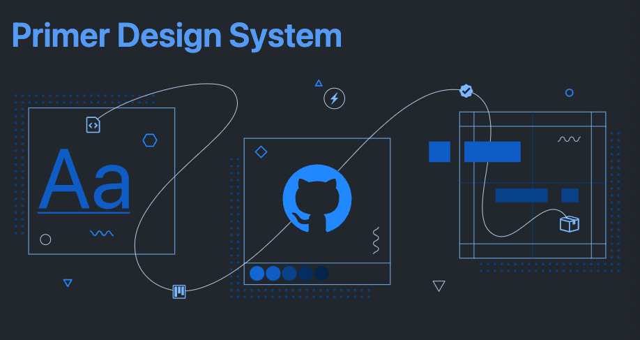
Primer is GitHub’s very own design system, crafted to help developers and designers create cohesive, user-friendly interfaces with ease.
Whether you're building a feature for GitHub or designing your next big project, Primer offers the tools and resources you need to ensure everything you create is polished, accessible, and visually aligned with modern design standards.
Features
- Comprehensive Component Library: Primer provides a rich collection of pre-built UI components, such as buttons, forms, and navigation elements. These components are not just visually appealing but are also designed with best practices in mind, ensuring consistency across your entire application.
- Designed for Flexibility: Primer isn’t a one-size-fits-all system; it’s built to be flexible. You can easily customize components to match your brand’s identity while maintaining a cohesive design language that users will instantly recognize and trust.
- Responsive and Accessible: With Primer, you don’t have to worry about your designs looking great only on certain devices. The design system is fully responsive, ensuring your interfaces are flawless on desktops, tablets, and mobile devices. Plus, accessibility is at the core of Primer, helping you create inclusive experiences that meet global standards.
- Developer-Friendly: Primer is made by developers, for developers. It’s easy to integrate into your projects, with detailed documentation and clear guidelines that make implementation straightforward. Whether you’re using React, Vue.js, or even plain HTML and CSS, Primer has you covered.
- Community and Support: As the design system behind GitHub, Primer benefits from a large, active community. This means continuous improvements, a wealth of resources, and a supportive environment where you can find help and inspiration.

Comparison
| Design System | Mobile Support | Community Support | Frameworks Support | License | Popularity | Recommendation |
|---|---|---|---|---|---|---|
| Google Material Design | Yes, extensively | Large, active community | React, Angular, Vue | Apache License 2.0 | High, widely used | For Mobile Apps |
| IBM Carbon | Limited, primarily desktop | Moderate, enterprise-focused | React, Angular, Vue | Apache License 2.0 | Moderate, enterprise usage | For Web Apps, prototyping |
| Polaris from Shopify | Yes, well-integrated | Strong within Shopify ecosystem | React | MIT License | Moderate, within Shopify | Web apps |
| Atlassian Design System | Limited, primarily desktop | Moderate, enterprise-focused | React, Angular, Vue | MIT License | Moderate, enterprise usage | User Heavy Web Apps as ERP and CRM Systems |
| Microsoft Fluent 2 | Yes, cross-platform | Strong, backed by Microsoft | React, Angular, Vue | MIT License | High, especially in Windows environments | Desktop Apps |
| DB UI Mono | Limited, primarily desktop | Small, niche community | React, Tailwind, TypeScript | MIT License | Low, niche usage | Web Apps |
| Salesforce Lightning Design System | Yes, Salesforce platform | Strong within Salesforce ecosystem | React, Vue, Angular | Proprietary, free for use on Salesforce platform | High, within Salesforce | Customer Engagment Apps |
| Primer Design System | Limited, primarily desktop | Growing, GitHub community | React, Vue, plain HTML/CSS | MIT License | Growing, especially in GitHub projects | Web Apps, Prototyping, Enterprise Apps |
Notable Design Systems
Conclusion
Choosing the right design system can significantly impact your product's consistency, scalability, and user experience.
These open-source design systems offer robust tools and frameworks to help enterprises and startups alike build cohesive, user-friendly applications efficiently. Explore the options and select the one that best aligns with your project needs and goals.