Flutter: Best 18 UI Packages to Spice up Your App Interface

Flutter is an open source UI software framework and development kit for building mobile (Android, iOS), Desktop and web apps.
It is originally created by Google on top of the Dart programming languages. Flutter has a vast community as it is still attracting developers since it is released in May 2017.
Currently, as We are working some Flutter projects for our regular clients, we decided to write about it.
In this article we list the best UI packages that Flutter developers can use to add more fancy effects and spice up their flutter app designs.
1- Animation
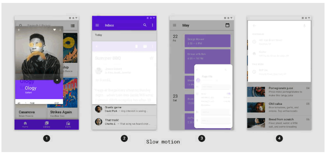
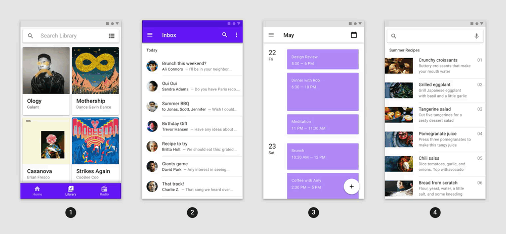
The flutter animation package contains pre-canned animations for commonly-desired effects. The animations can be customized with your content and dropped into your application to delight your users.
It comes with dozens of examples and animation options which include container transform, fading animation, card animation, fade through effects, and more.
The animations can be applied to almost anything: containers, dialogs, menus, snackbar, floating action button (FAB), pages, search bar and images.
2- Curved Navigation Bar
Navigation Bar with an amazing transitional effect and full control for background color, animation, animation duration and more.
You can use it directly inside your code as it offers a simple API:
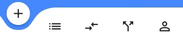
Scaffold(
bottomNavigationBar: CurvedNavigationBar(
backgroundColor: Colors.blueAccent,
items: <Widget>[
Icon(Icons.add, size: 30),
Icon(Icons.list, size: 30),
Icon(Icons.compare_arrows, size: 30),
],
onTap: (index) {
//Handle button tap
},
),
body: Container(color: Colors.blueAccent),
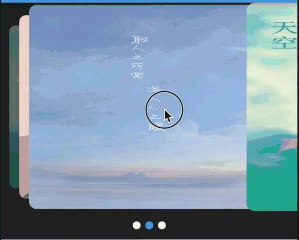
)3- Smooth Page Indicator
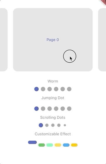
The Smooth Page Indicator package allows you to quickly add an animated indicator to your pages, widgets, slides, or screens with minimal effort and several customized options.
The indicator widget has various options to customize the animation, shape, and colors. It includes worm effect, expanding dots, scale effect, scrolling dots, jumping dots and swap effect.
4- Card Swiper
The Card Swiper package enables you to add a fancy transition effects to your cards, which include multiple layouts, infinite loop support, and works with full compatibility with Android and iOS.
5- Slidable

Slidebar packages enables you to add quick slide effect for your list items, or anything to show action buttons or information block without the need to worry about the internals.
Slidable package features
- Accepts start (left/top) and end (right/bottom) action panes.
- Can be dismissed.
- 4 built-in action panes.
- 2 built-in slide action widgets.
- 1 built-in dismiss animation.
- You can easily create custom layouts and animations.
- You can use a builder to create your slide actions if you want special effects during animation.
- Closes when a slide action has been tapped (override-able).
- Closes when the nearest
Scrollablestarts to scroll (override-able). - Option to disable the slide effect easily.
6- Flutter Spinkit
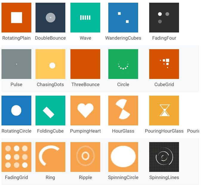
If you are looking to add a loading indicator to your app, then we suggest Flutter Spinkit. It includes a rich collection of animated loading indicator that works seamlessly on Android and iOS.
You can easily customize the duration, colors, and create a complex combined animation. The best thing is it does not take much to be installed to any flutter project.
7- Card Loading
The Card loading is a lightweight flutter package that allows you to add an animated loading effect for your cards.
8- Flutter_custom_dialog
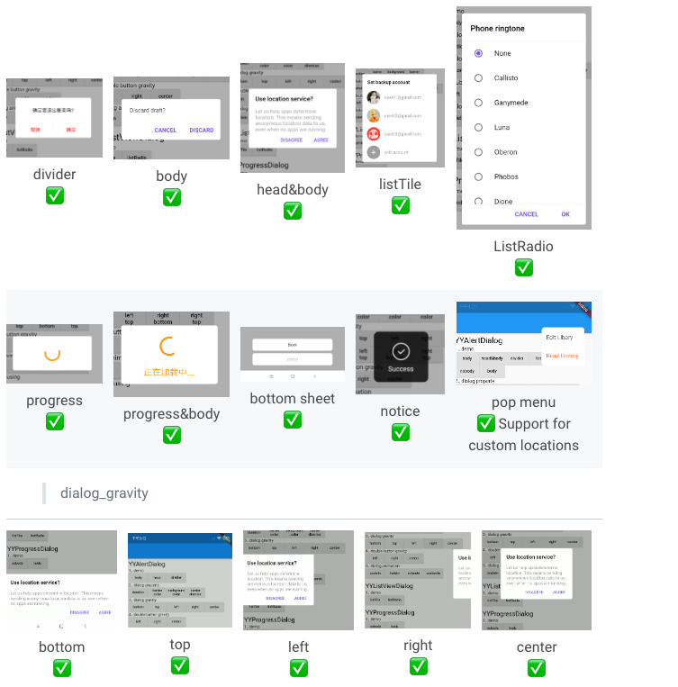
This package (Flutter Custom Dialog) enables you to add custom reactive and data-rich dialog to your Flutter apps without having to worry about configuration or extensive setup.
It comes with several ready-to-use examples as it allows you to add almost anything to your dialog container, as well as control your dialog position, and animation.
9- Adaptive dialog
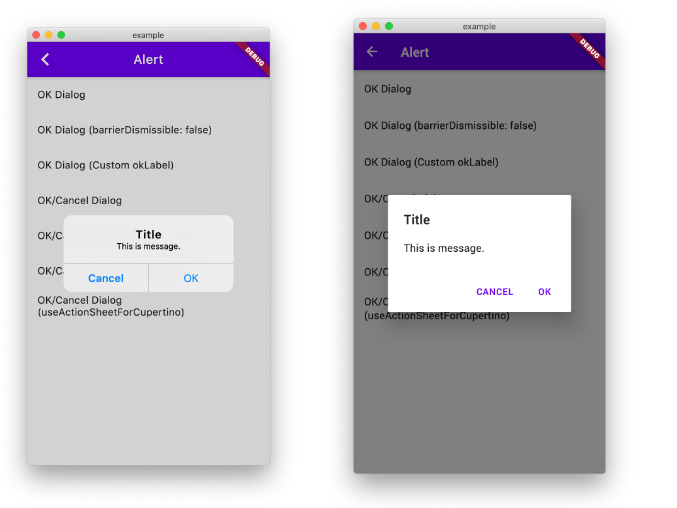
The Adaptive Dialog package offer you native looks and feels for your dialogs for Android and iOS apps.
10- Flip Card
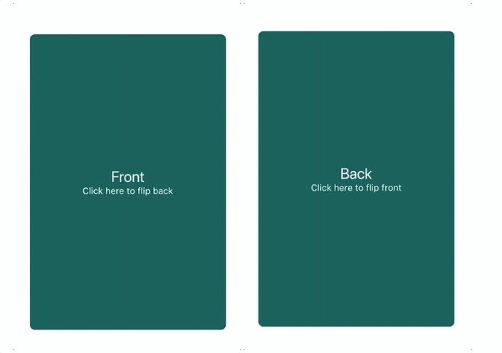
If you require a flipping card effect to display information on the back of your card, we highly recommend this outstanding package. It takes seconds to add, and setup, customize and include your front and back card containers.
You can also flip your card vertically or horizontally, control duration, and the color fill for your card.
11- Motion Toast
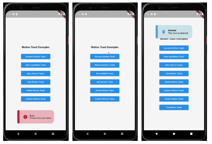
The Motion Toast package allows you to add fancy toast effects and animation to your apps in no time, with full control of the toast position, colors, icons, duration and more.
Motion Toast features
- Animated toasts with animated icons
- Built-in types (Success, Warning, Error, Info, Delete)
- Possibility to design your own toast
- Different color themes (multiple colors support)
- Support null safety
- Heartbeat animations
- Full customized text
- Built in animations
- Customize toast layout (LTR/RTL)
- Customize toast duration
- Customize Motion toast position (Center, Bottom, Top)
- Support long text
- Background style customization
- Display simultaneous toasts
- Customizable barrier color
- Enable dismiss when toast is displayed (top, center, bottom)
- Responsive toast according to device size
- Customizable width and height
- Customizable box constraints
- Customizable toast padding
- Customizable border display
- Customizable sidebar widget display
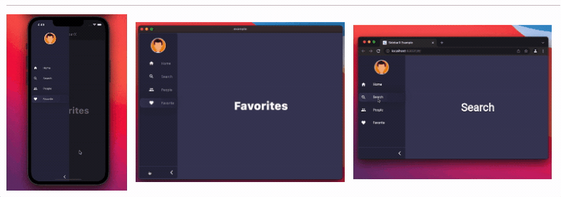
12- Foldable Sidebar
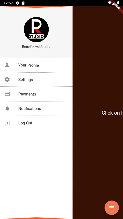
An easy to implement Foldable Sidebar Navigation Drawer for Flutter Applications.
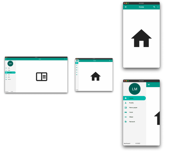
13- collapsible_sidebar
A collapsible sidebar for Flutter apps implementing the Material Design. It supports Android, iOS, Desktop, and Flutter web. The package is based on the Material design, comes with pre-built customizable tile widgets that collapse, smooth animation, and full RTL/ LTR languages support.
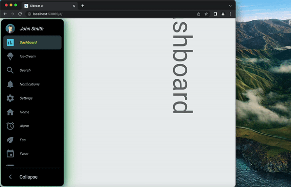
14- SidebarX
The SidebarX package offers you a highly customizable responsive sidebar for your desktop, mobile, and web Flutter apps.
15- Easy Dashboard
The Easy Dashboard package will help you easily create dashboard layouts and other navigation features. It aims in making responsive dashboards an easy process.
15- Step Progress Indicator
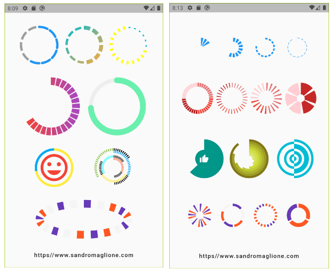
The Step Progress Indicator is an open source Flutter package, bar indicator made of a series of selected and unselected steps. It offers a vast option of progress indicator that includes simple line indicator, block indicator, many circular indicator options, and several customization options. Note that you can also customize the animation of every single indicator.
16- Intro
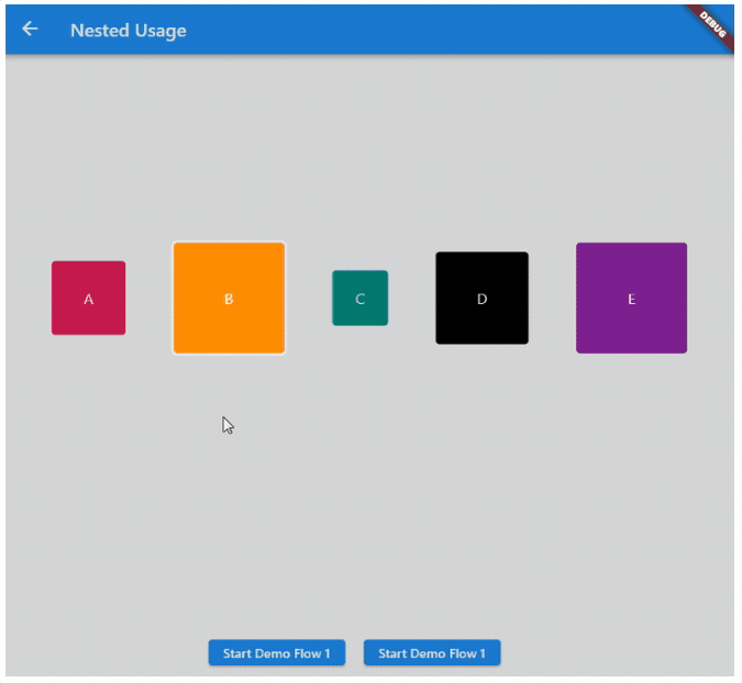
The Intro Flutter package is a step-by-step wizard, which can help you to introduce your product or to demonstrate the usage of your application.
The Intro package features highlight:
Step by step demonstration
- Control the demo flow
- Highlight the target widget
- Automatically calculates the location and alignment of intro card
- Customizable style and behavior
- Supports nesting of multiple demo flow
- Link between different pages or dialogs
- Full platform support
17- Icony
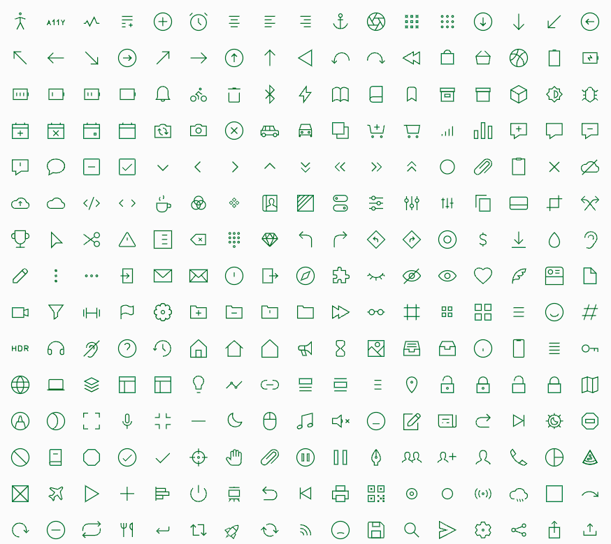
If you are not satisfied with the built-in Flutter Icon package, we recommend trying this open source Icon package Icony. It comes with Ikonate icon library that contains 327 icons, and 4122 game icons.
18- Awesome Snackbar Content
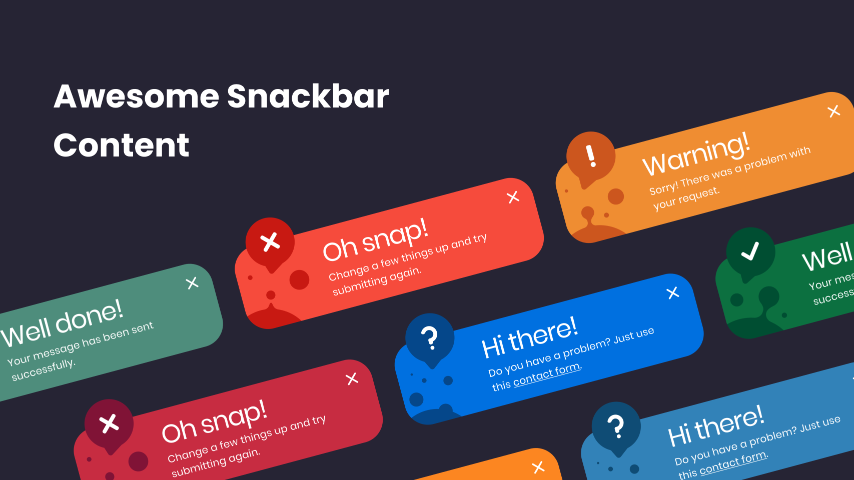
A package that lets you uplift your SnackBar or MaterialBanner experience in the app.
If you know of any other cool app that deserves to be on this list, let us know.