Add Real Animated Magic to your React and Astro Apps with Magic UI

Are You Truly Ready to Put Your Mobile or Web App to the Test?
Don`t just assume your app works—ensure it`s flawless, secure, and user-friendly with expert testing. 🚀
Why Third-Party Testing is Essential for Your Application and Website?We are ready to test, evaluate and report your app, ERP system, or customer/ patients workflow
With a detailed report about all findings
Contact us nowTable of Content
Magic UI is a versatile UI design tool that streamlines the creation of user interfaces. It is designed to be intuitive and supports a wide range of frameworks, making it an ideal choice for developers and designers looking to enhance their workflow.
Benefits of Magic UI
1. Intuitive Interface
Magic UI offers a user-friendly interface that makes it easy to design and prototype without needing extensive coding knowledge.
2. Framework Support
Magic UI supports multiple frameworks, including:
- React
- Vue.js
- Angular
- Svelte
This allows developers to integrate their designs seamlessly into their existing projects.
3. Customizable Components
Magic UI provides a library of customizable components that can be easily tailored to fit the specific needs of any project.
4. Real-Time Collaboration
Magic UI supports real-time collaboration, enabling teams to work together efficiently and make design decisions quickly.
5. Responsive Design
With Magic UI, creating responsive designs that work on various devices and screen sizes is straightforward, ensuring a consistent user experience across platforms.
Getting Started with Magic UI
Installation
Import into your project:
import { Button, Card } from 'magicui';
Install via npm (example for a React project):
npm install magicui
Basic Usage
Here’s a simple example of using Magic UI components in a React application:
import React from 'react';
import { Button, Card } from 'magicui';

function App() {
  return (
    <div>
      <Card>
        <h2>Welcome to Magic UI</h2>
        <p>Design your UI effortlessly.</p>
        <Button onClick={() => alert('Button clicked!')}>Click Me</Button>
      </Card>
    </div>
  );
}

export default App;
Customizing Components
Magic UI components can be easily customized to match your design requirements. For instance, customizing a button:
<Button style={{ backgroundColor: 'blue', color: 'white' }}>
  Custom Button
</Button>
Real-Time Collaboration
Magic UI allows for real-time collaboration, making it easy for teams to work together. Share your project link with team members, and they can join and contribute to the design process instantly.
List of Components in Magic UI
- Marquee
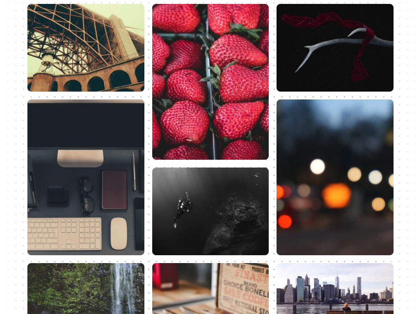
- Bento Grid
- Animated List
- Dock
- Globe
- Tweet Card
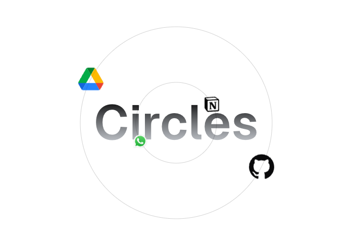
- Orbiting Circles
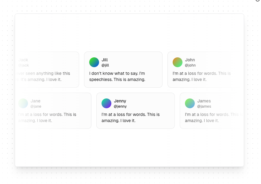
- Avatar Circles
- Interactive Icon Cloud
- Animated Circular Progress Bar
- File Tree
- Animated Beam
- Border Beam
- Shine Border
- Magic Card
- Meteors
- Neon Gradient Card
- Confetti
- Particles
- Cool Mode
- Blur Fade
- Number Ticker
- Animated Shiny Text
- Animated Gradient Text
- Text Reveal
- Word Rotate
- Typing Animation
- Blur In
- Scroll Based Velocity
- Letter Pullup
- Word Pull Up
- Flip Text
- Gradual Spacing
- Word Fade In
- Fade Text
- Box Reveal
- Sparkles Text
- Shimmer Button
- Shiny Button
- Animated Subscribe Button
- Pulsating Button
- Animated Grid Pattern
- Retro Grid
- Ripple
- Dot Pattern
- Grid Pattern
Conclusion
Magic UI is a powerful tool that simplifies the UI design process, supporting multiple frameworks and offering a range of customizable components. Its real-time collaboration and responsive design features make it a valuable asset for any development team. Start using Magic UI today to enhance your UI design workflow.
 dillionverma