18 Free Svelte UI Tools for Building Stunning, Responsive Web Apps


Table of Content
Svelte, a revolutionary JavaScript framework, has gained significant traction among developers for its simplicity, speed, and ease of use. Unlike other frameworks, Svelte shifts much of the work to compile time, resulting in faster and smaller apps.
However, while Svelte provides an excellent foundation for building applications, developers often seek additional tools and libraries to enhance their projects. This is where Svelte UI frameworks and design systems come into play.
Benefits of Using Svelte UI Frameworks and Design Systems
Integrating Svelte UI frameworks and design systems into your project can offer several key benefits:
- Speed Up Development: These frameworks provide pre-built components and design systems that save time, allowing you to focus on the unique aspects of your application rather than reinventing the wheel.
- Consistency in Design: Utilizing a design system ensures that your application maintains a consistent look and feel across all components, improving the overall user experience.
- Responsiveness: Many Svelte UI libraries come with built-in responsiveness, ensuring that your application looks great on all devices, from mobile phones to desktops.
- Accessibility: Many frameworks are designed with accessibility in mind, helping you create apps that are usable by everyone, including those with disabilities.
- Customization: These frameworks are often highly customizable, allowing you to tweak components to match your brand’s identity while still benefiting from the underlying structure and style guidelines.
- Community and Support: Many of these libraries are backed by active communities, offering support, updates, and a wealth of resources to help you overcome any challenges.
In this post, we explore 18 free Svelte UI frameworks and libraries that can significantly enrich your Svelte applications, offering everything from pre-built components to fully-fledged design systems.
1. Ikun UI
Ikun UI is a free 🐔 Svelte.js based UnoCSS UI library that allows you to make websites.
Ikun UI Features:
- 🎤 Components Design - Onu provides neat & beautiful crafted UI components.
- 💃 Iconify Icons - Use any icon from the library you love.
- 🤟 CSS Preset - Provides UnoCSS preset package, help you render UI easily.
- On-Demand Generation: UnoCSS generates only the CSS you use in your HTML, which reduces the file size and increases performance.
- Extensible with Presets: UnoCSS comes with a range of built-in presets like Tailwind CSS, Windi CSS, and more, allowing you to quickly start with familiar utility classes.
- Customizable: Users can create their own utility classes, define custom themes, and configure the framework to fit their specific needs.
- Zero Runtime Overhead: Unlike some other frameworks, UnoCSS generates static CSS, meaning there's no JavaScript runtime overhead.
- Intelligent IntelliSense Support: UnoCSS offers excellent integration with IDEs, providing intelligent suggestions and auto-completion for utility classes.
- Integration with Popular Frameworks: It supports integration with frameworks like Vue, React, and Svelte, making it easy to use in various projects.
- Atomic CSS Mode: UnoCSS can be used in atomic mode, where each utility generates a single CSS rule, ensuring minimal CSS output.
- Lightweight: UnoCSS is designed to be extremely lightweight, with minimal dependencies, ensuring fast build times and a smaller bundle size.
- Variants and Responsiveness: It supports responsive variants, state variants (like hover, focus), and pseudo-classes, allowing you to easily apply styles under specific conditions.
- Tree-Shakable: UnoCSS can tree-shake unused styles, ensuring that only the CSS used in your project is included in the final bundle.
- First-Class Theme Support: Easily customize your project’s theme with UnoCSS’s robust theming system.
- JIT Compilation: Supports just-in-time (JIT) compilation, where styles are generated on-demand during development, ensuring fast and efficient builds.
- Integrated with Vite: UnoCSS works seamlessly with Vite, providing fast HMR (Hot Module Replacement) and a smooth development experience.
- TypeScript Support: Offers built-in TypeScript support, allowing developers to write type-safe styles.
- Easy Setup: UnoCSS has a simple setup process, making it easy to integrate into new or existing projects.
 ikun-svelte
2. Smelte
Smelte is a UI framework built on top of Svelte and Tailwind CSS using Material Design spec (hence the name).
It comes with many components and utility functions making it easy to build beautiful responsive layouts while keeping bundle size and performance at check all thanks to Svelte.
Features
- Default typography per Material design spec
- Material icons
- CSS ripple animation
- Image lazy loading
- Now SSR deployment
- Color palette generator
- Improve Purge CSS
- Theming
- Image processing (done here)
- Svelte template (without Sapper)
- JS ripple animation
- Dark mode
matyunya2. SvelteUI
SvelteUI is an all inclusive Svelte library - Components, Actions, Utilities, Animations.
Features
- SvelteKit and SSR Compatible
- TypeScript and type definitions are supported, but optional
- All components are accessible according to WAI-ARIA standards
- Dark theme included, as well as a custom theming api
- Minimal third-party dependency usage
- Easy setup - Zero Configuration
svelteuidev3. Skeleton UI
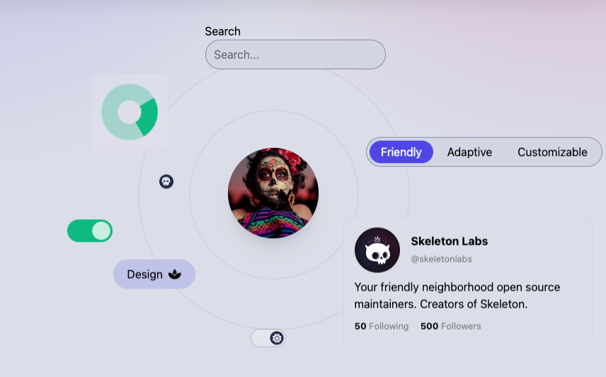
Skeleton is a UI toolkit designed for Svelte and Tailwind CSS, enabling developers to build adaptive and accessible interfaces for web applications of any size or shape.
The toolkit includes a wide range of pre-built components, layouts, and styles that are easy to customize and integrate into projects. With a focus on accessibility and adaptability, Skeleton helps developers deliver web apps that work seamlessly across various devices and platforms.
Features
- Svelte Integration: Fully integrated with Svelte, making use of its reactive framework for building dynamic user interfaces.
- Tailwind CSS Compatibility: Built on top of Tailwind CSS, allowing you to utilize Tailwind's utility-first approach for styling.
- Responsive Design: Provides tools and components that adapt to any screen size, ensuring your web apps are fully responsive.
- Accessibility Focused: Ensures that all components and layouts are accessible, following best practices to support users with disabilities.
- Pre-built Components: Includes a comprehensive set of pre-built components like buttons, modals, forms, and more, ready to be customized and used in your projects.
- Customizable Themes: Allows for easy theming and customization, enabling you to create a unique look and feel for your application.
- Layouts and Grid System: Offers a flexible grid system and layouts that help in structuring your content effectively across different devices.
- Interactive Elements: Includes interactive elements such as dropdowns, tabs, and carousels, enhancing the user experience.
- Lightweight and Performant: Designed to be lightweight, ensuring fast load times and optimal performance for your web applications.
- Dark Mode Support: Built-in support for dark mode, allowing you to easily implement and toggle between light and dark themes.
- Utility-first Design: Encourages the use of utility classes for rapid development and minimal CSS overhead.
 Skeleton Labs
4. Svelte Material UI
A library of Svelte Material UI components, based on Material Design Components - Web.
Features
- Material Design Integration: Implements Google’s Material Design guidelines, providing a consistent, modern look and feel for your applications.
- Svelte Compatibility: Fully integrated with Svelte, ensuring seamless interaction with Svelte’s reactive components and framework.
- Comprehensive Component Library: Offers a wide range of pre-built components, such as buttons, dialogs, cards, forms, and more, all adhering to Material Design standards.
- Customizable Themes: Allows for easy customization of themes, including colors, typography, and overall design, to match the specific branding of your project.
- Responsive Design: Components are built to be responsive, ensuring they work well across different screen sizes and devices.
- Accessibility Support: Focuses on accessibility, with components designed to be usable by everyone, including those with disabilities.
- Icon Integration: Includes support for Material Icons, making it easy to add consistent and visually appealing icons to your application.
- Lightweight and Performant: Designed to be efficient and lightweight, minimizing the impact on load times and performance.
- TypeScript Support: Provides built-in TypeScript support, allowing developers to use type-safe code and benefit from better tooling and error-checking.
- Custom Elements: Supports the creation of custom elements, giving developers the flexibility to extend or modify existing components.
hperrin5. Svelte Tweakpane UI
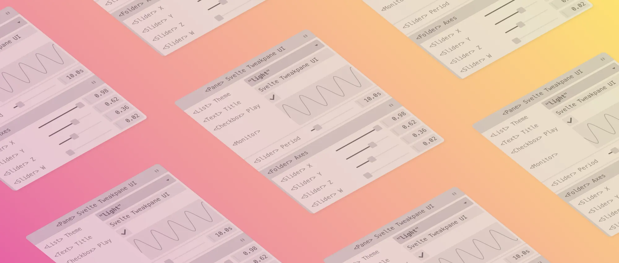
🎛️ Svelte Tweakpane UI wraps user-interface elements from the excellent Tweakpane library in a collection of 31 idiomatic, reactive, type-safe, carefully-crafted, and obsessively-documented Svelte components.
The library makes it easy to quickly and declaratively add knobs and dials to your projects using components that feel like they were made for Svelte. It also augments Tweakpane with a few extra features for your convenience and enjoyment.
kitschpatrolkitschpatrol6. Svelte-HeadlessUI
Svelte Headless UI is an implementation of the Headless UI component library for Svelte, inspired by the original Headless UI developed for React and Vue by Tailwind Labs. This library provides a collection of unstyled, fully accessible UI components that can be customized and styled according to your needs.
Since the components are "headless," they do not impose any specific design, allowing developers to have full control over the appearance of their applications.
Features
- ✅ Completely unstyled
- ✅ Fully WIA-ARIA accessible UI components
- ✅ Fully typed with Typescript
- ✅ Designed to integrate beautifully with Tailwind CSS
- ✅ Designed to integrate beautifully with Svelte and SvelteKit
- ✅ Less than 14kB minified / 4kB minified gzipped
CaptainCodeman7. Fluent Svelte
fluent-svelte is an experimental Svelte component UI library that emulates the look and feel of Microsoft's Windows UI Controls which conform to the Fluent Design System.
Features
- SvelteKit and SSR Compatible
- TypeScript and type definitions are supported, but optional.
- Full RTL support with no additional configuration.
- All components are accessible according to WAI-ARIA standards.
- Theming support using CSS custom properties.
- Minimal third-party dependency usage.
- Reduced motion support.
- Easy setup. Just install the library, add some base styles, and you're ready to go.
- Minimal CSS overhead. Styles are included and scoped alongside their respective components, only bundling the CSS you need.
Tropix1268. Straight-forward Svelte UI for the Web
Straight-forward Svelte UI for the Web.
Features
- Svelte-first: All Components are API designed to work well with Svelte as a first-class citizen.
- Typescript Native: Kahi UI tries to be fully typed by using TypeScript as its base language, so you get a complete IDE experience.
- Progressive Enhancements: Where possible, most logic is codified via CSS / HTML directly. With Javascript-enabled UX enhancements enabled for compatible clients.
- Composable: While 30+ prebuilt Components are available, Kahi UI also provides primitives to design your Web Application's UI without touching CSS.
- Dark Mode: Components in Kahi UI change colors when a compatible Browser views w/ Dark Mode.
- Framework Independent: Even though Svelte-first, there is no hard toolchain dependencies required. You can just take the built CSS files and use with React or in a traditional SSR environment.
novacbn9. Bits UI
The headless components for Svelte.
Bits UI is a modern, minimalist component library designed for React, focusing on simplicity and ease of use. Built with Tailwind CSS, Bits UI offers a collection of clean, reusable UI components that can be quickly integrated into Svelte projects.
The library is designed to be lightweight and performant, allowing developers to create visually appealing user interfaces without the overhead of complex configuration.
Its components are fully customizable, making it easy to adapt the design to match the specific needs of any project. Bits UI is particularly well-suited for developers looking for a straightforward, no-nonsense approach to building responsive and accessible web applications.
huntabyte10. Ato UI
The elemental UI component library for Svelte, built with UnoCSS and Melt UI.
Features
- 🦄 Headless + Styled components
- 🎨 Themeable with an easy to use designers page
- 🎯 Written in TypeScript
- 👍 Strict adherence to WAI-ARIA guidelines (built on top of accessible headless libraries)
- ✈️ Convenient CSS shortcuts & tokens
- 😃 Pure CSS icons of all your favourite icon sets thanks to iconify and UnoCSS
bennymi11. Attractions
A pretty cool UI kit for Svelte.
illright12. Melt UI
Melt UI is a set of headless, accessible component builders for Svelte.
Features
- Uncoupled builders that can be attached to any element/component
- Typescript and SvelteKit support out-of-the-box
- Strict adherence to WAI-ARIA guidelines
- Easy to use examples and documentation
- A high emphasis on accessibility, extensibility, quality and consistency
melt-ui13. Shadcn
ShadCN UI is a modern and versatile UI component library designed specifically for Svelte, drawing inspiration from Radix UI and Tailwind CSS. It provides a comprehensive set of pre-built, customizable components that can be seamlessly integrated into Svelte projects.
ShadCN UI is focused on delivering high-quality, accessible components that are easy to style and extend, making it an excellent choice for developers looking to build responsive and feature-rich user interfaces with minimal effort.
ShadCN UI offers a robust and developer-friendly solution for building stylish, accessible, and responsive interfaces with Svelte and Tailwind CSS.
Features
- Svelte Integration: Specifically designed for Svelte, ensuring seamless integration with the Svelte framework.
- Tailwind CSS Compatibility: Leverages Tailwind CSS for styling, offering a utility-first approach to design that allows for easy customization.
- Pre-built Components: Includes a wide array of ready-to-use components such as buttons, modals, forms, dropdowns, and more, designed to be flexible and customizable.
- Accessibility Focus: Ensures that all components are built with accessibility in mind, adhering to best practices to support users with disabilities.
- Customizable Themes: Offers theme customization options, enabling developers to easily tailor the look and feel of their applications to match specific design requirements.
- Responsive Design: Components are designed to be fully responsive, ensuring they look and function well on devices of all sizes.
- Interactive Elements: Provides interactive components like accordions, tooltips, and popovers, enhancing user experience and engagement.
- Minimal Dependencies: ShadCN UI is designed to be lightweight with minimal dependencies, ensuring fast load times and optimal performance.
- Open Source: The library is open-source, allowing developers to contribute and extend its functionality according to their needs.
- Comprehensive Documentation: Accompanied by thorough documentation that includes usage examples, making it easy to get started and implement in projects.
 huntabyte
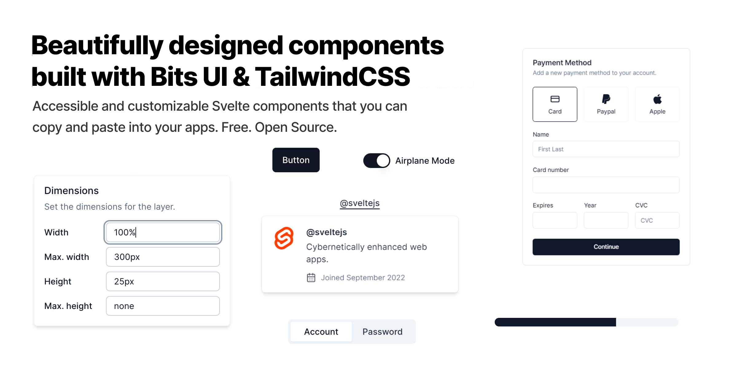
14. Floating UI Svelte (WIP)
Floating UI is a Svelte library for position floating elements and handling interaction. Inspired by Floating UI.

15. Bootstrap 4 & 5 components for Svelte
Bootstrap 4 & 5 components for Svelte.
bestguy16. Svelma
Svelma is a set of UI components for Svelte based on the Bulma CSS framework.
c0bra17. stwui
Svelte-TailwindCSS UI (STWUI) is currently in pre-release. There has been a lot work already but a lot of work still needs to be done.
Most of my inspiration comes from TawilwindUI with a desire to create a component library similar to React component libraries that are less reliant on remembering class names. Contributors and collaborators welcome!
N00nDay18. Svelte Commerce with eCommerce UI
The open-source storefront for any eCommerce. Built with a PWA and headless approach, using a modern JS stack.
The API approach also allows you to merge Svelte Commerce with any third-party tool like payment gateways, POS or AI. It is a WIP project for MedusaJS, Woocommerce, Bigcommerce and Shopify.
Features
- 👨🏻💻 Its both SSR and SPA
- 🚀 Superfast
- 🔗 It is possible to connect with any eCommerce backend if the backend has Rest API
- 🔓 Svelte Commerce is free and open source. Download and modify it the way you want
- 🛒 Most of the essential features for ecommerce are already integrated
- 💰 No need to make a big leap or invest huge amount. Just take this opend source project and attach to existing backend.