Explore 19 Free TailwindCSS JSX Libraries to Speed Up Your Next.js and React Projects
18 Free Tailwind Components Resources in JSX Format for React and Next.js

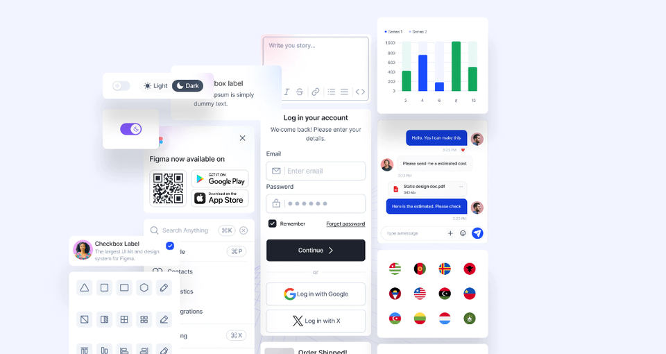
Table of Content
When working with React and Next.js, finding well-designed and responsive UI components can significantly speed up your development process. Tailwind CSS, known for its utility-first approach, pairs beautifully with these frameworks.
The combination of Tailwind's flexibility and pre-built JSX components allows developers to focus more on logic rather than building interfaces from scratch.
How These Libraries Boost Your Development:
- Saves Time: Quickly integrate pre-built elements tailored for Tailwind CSS, React, and Next.js instead of building components from scratch.
- Consistency: Ensure uniform design patterns across your project, offering a cohesive user experience.
- Customizable: Easily tweak styles or extend functionality to meet your project's specific needs, despite being pre-built.
- Improved Workflow: Focus on building features rather than styling and formatting, leading to faster deployments.
 Hazem Abbas
How to Choose the Right Library:
Consider these factors when selecting a Tailwind component library for your project:
- UI Complexity: For larger projects with intricate interfaces, opt for comprehensive libraries with diverse component options.
- Customization Needs: Choose libraries with highly flexible and modular components if your project demands extensive customization.
- Performance: Prioritize lightweight libraries for performance-critical applications, especially when building with Next.js, which emphasizes speed and efficiency.
- Community Support: Select libraries with active communities, as they often receive updates and have better documentation, easing integration and troubleshooting.
In this post, we'll showcase 19 free and open-source Tailwind component libraries in JSX format that can boost your productivity. These resources offer a variety of elements like buttons, forms, modals, and navigation bars to help you get started, whether you're building a simple blog or a complex web app.
1- Shadcn
ShadCN UI is a modern and flexible component library designed for React, making it ideal for web and desktop applications using frameworks like Electron and Tauri. It offers a wide range of prebuilt, customizable UI components that follow popular design principles, ensuring consistency and efficiency in building user interfaces.
ShadCN UI stands out for its ease of use, flexibility, and comprehensive features. It's a top recommendation for developers building modern React applications, whether for the web or desktop.
Why It's Recommended for React Developers:
- Prebuilt Components: ShadCN UI includes a collection of pre-styled components that integrate seamlessly into React projects, allowing developers to focus on logic and functionality.
- Customizable: Components are easily customizable to match branding and design requirements, offering flexibility without reinventing the wheel.
- Tailored for Modern Development: It supports tools and frameworks like Electron and Tauri, making it an excellent choice for building both web and desktop applications with a single codebase.
- TypeScript Support: ShadCN UI offers built-in TypeScript support, ensuring strong type checking and an improved development experience.
 shadcn-ui
2- NextUI
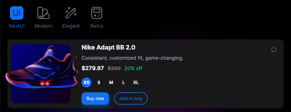
NextUI is a fast, responsive React UI library built on Tailwind CSS. It offers over 50 customizable components for creating clean, efficient applications. This powerful combination of React and Tailwind CSS allows developers to rapidly build modern, responsive user interfaces with minimal effort.
NextUI accelerates React and Tailwind development, providing responsive, customizable components that seamlessly work across web and desktop platforms. Its extensive component library, combined with the flexibility of Tailwind CSS, allows developers to create polished, professional-looking applications in less time. The built-in dark mode support and accessibility features make it an excellent choice for projects that prioritize user experience and inclusivity.
Moreover, NextUI's focus on performance ensures that applications built with this library are fast and efficient, which is crucial for maintaining user engagement in today's competitive digital landscape. The TypeScript support adds an extra layer of reliability to your codebase, making it easier to maintain and scale your projects over time.
Hazem Abbas
Features:
- Component Library: 50+ components including buttons, inputs, cards, and modals, providing a comprehensive toolkit for UI development
- Dark Mode: Built-in support for light and dark themes, enhancing user experience and accessibility
- Performance: Optimized for speed and lightweight applications, ensuring smooth user interactions
- Responsive: Fully responsive components by default, adapting seamlessly to various screen sizes and devices
- Customizable: Tailwind-based styling for easy customization, allowing developers to tailor components to their specific design needs
- TypeScript Support: Native integration for strong typing, improving code quality and developer productivity
- Accessibility: Components are designed with accessibility in mind, ensuring inclusive user experiences
Hazem Abbas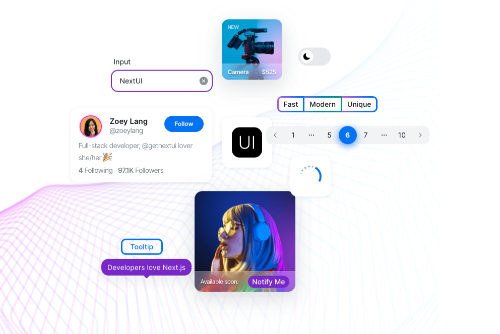
3- Flowbite React
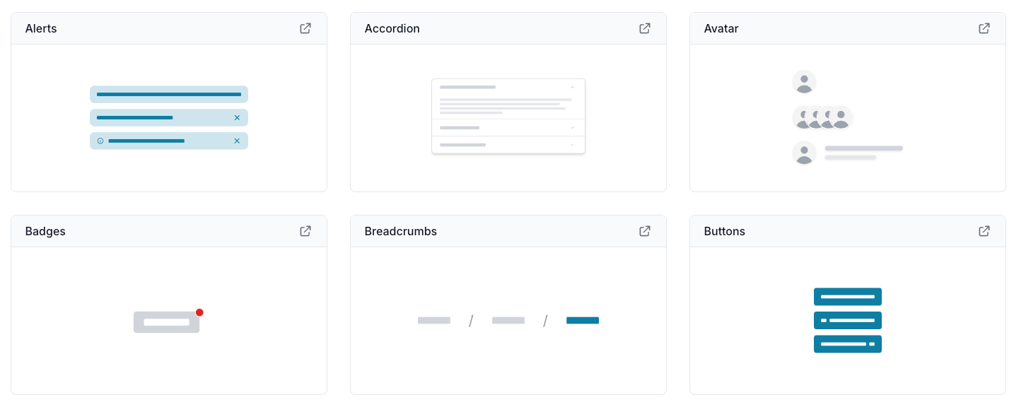
Flowbite is a comprehensive React component library built on top of Tailwind CSS, designed to accelerate the development of modern, responsive, and visually appealing user interfaces. This powerful toolkit combines the flexibility of Tailwind with the convenience of pre-built components, offering developers a streamlined approach to creating sophisticated web applications.
By utilizing Flowbite, developers can dramatically reduce development time and effort. The library's well-documented components allow for rapid prototyping and iteration, enabling teams to focus on core functionality and user experience rather than getting bogged down in UI implementation details.
Key Features:
- Component Library: 50+ pre-built, customizable React components.
- Tailwind Integration: Seamless integration with Tailwind CSS for consistent styling.
- Dark Mode: Built-in support for light and dark themes.
- Accessibility: Components designed with accessibility in mind.
- Flexibility: Adaptable to various branding and design needs.
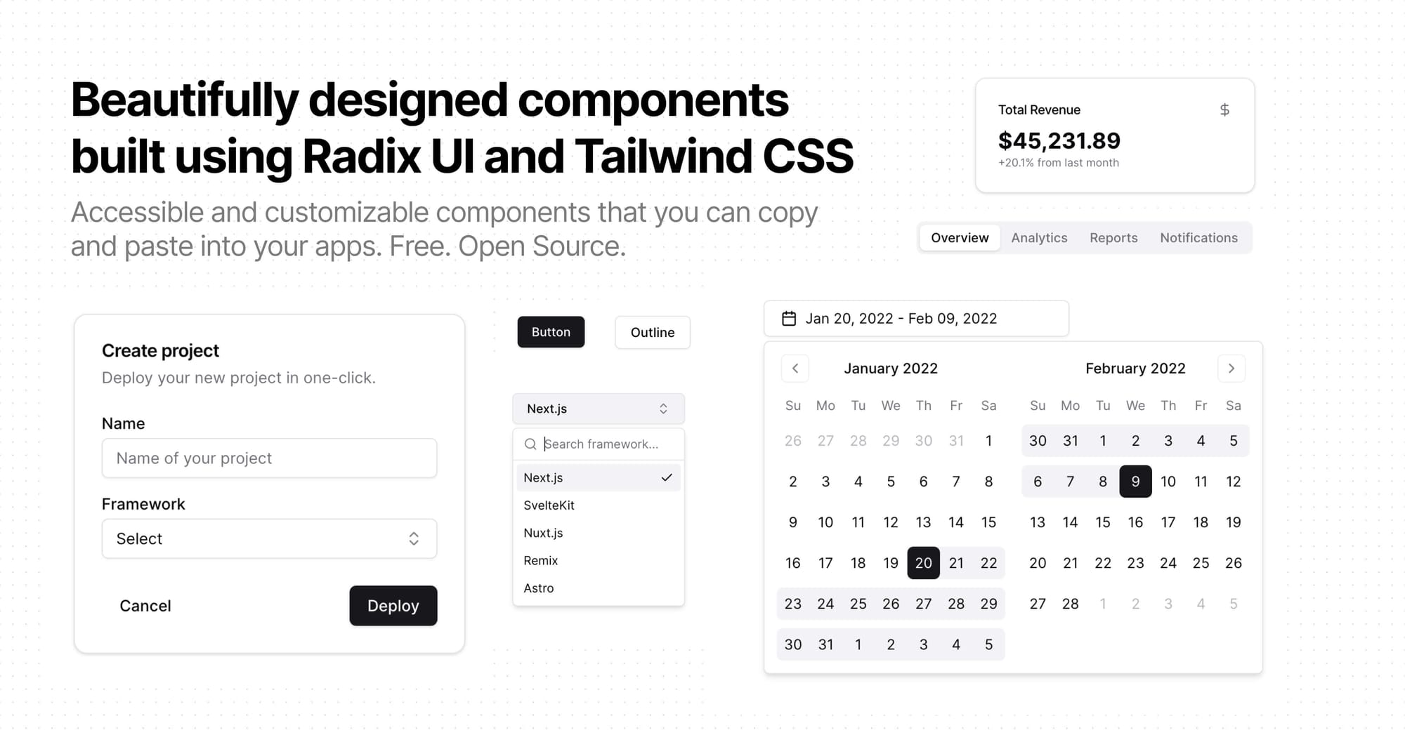
themesberg4- Float UI
Float UI is a modern component library designed for building clean and responsive UIs. It supports React, Vue, Astro, and Svelte, making it versatile for various frontend frameworks.
Float UI simplifies the development process across multiple frameworks, offering responsive, lightweight, and easily customizable components for modern web development.
Features:
- Multi-Framework Support: Works with React, Vue, Astro, and Svelte.
- Component Library: Offers a range of customizable components, such as buttons, cards, and modals.
- Responsive Design: All components are fully responsive.
- Lightweight: Optimized for fast performance.
- Customizable: Easily adaptable to fit project-specific designs.

5- Keep React
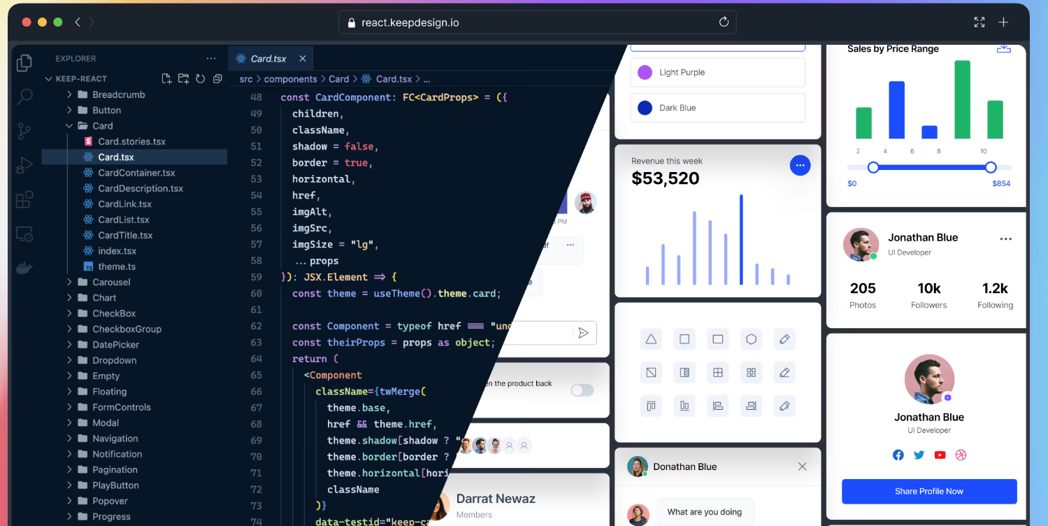
Keep Design React is a comprehensive UI component library that delivers a modern and efficient development experience for React applications. It stands out with its sleek design and flexibility, offering developers a consistent, customizable, and scalable design system.
KeepDesign React is ideal for React developers seeking a robust, consistent, and scalable design system. It combines modern design, flexibility, and performance optimization, making it perfect for easily building high-quality, responsive web applications.
Unique Features:
- Comprehensive Component Library: Provides a wide range of UI components—including forms, buttons, cards, modals, and tables—all designed with clean, modern aesthetics.
- Customizability: Easily tailor components to match your project's design using built-in configuration options.
- Theme Support: Includes built-in theme support, simplifying style switching and maintaining visual consistency across your app.
- Design System Integration: Built around a robust design system, ensuring your application's UI remains consistent and scalable as it grows.
- Responsive and Accessible: All components are fully responsive and designed with accessibility in mind, making the library suitable for both web and mobile applications.
- Lightweight and Performant: Optimized for performance, KeepDesign React keeps applications fast and responsive, even when using numerous components.
StaticMania6- Mamba UI
Mamba UI is a free Tailwind CSS component library that helps developers rapidly create responsive, modern web applications. It offers customizable, mobile-friendly UI elements like buttons, cards, forms, and navigation bars. This library is perfect for developers seeking a simple way to incorporate clean, minimalist designs into their Tailwind projects.
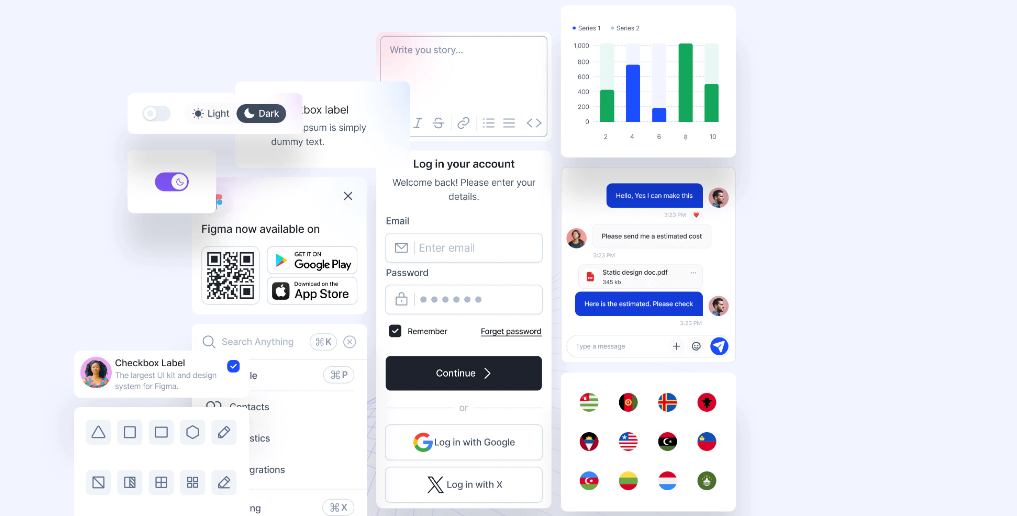
Microwawe7- Material UI
Material Tailwind is a component library that blends Material Design principles with Tailwind CSS. It offers developers a versatile toolkit for creating attractive, responsive interfaces. The library includes over 120 prebuilt, customizable components—such as buttons, forms, and modals—that follow Material Design guidelines while leveraging Tailwind CSS's flexibility.
It supports several frameworks as React, Create React App, Next.js, Remix, Vite, Astro, Gatsby, and offers a code snippets in HTML.
Features
- Material Design + Tailwind CSS: This unique blend combines Material's structured design with Tailwind's utility-first approach, offering developers the best of both worlds.
- Customization: Tailwind's utility-based system enables deep customization while preserving Material Design's core aesthetics.
- Dark Mode Support: Built-in light and dark themes enhance the user experience.
- Component Variety: With over 640 components—including cards, navigation bars, and form elements—building rich, interactive applications becomes effortless.
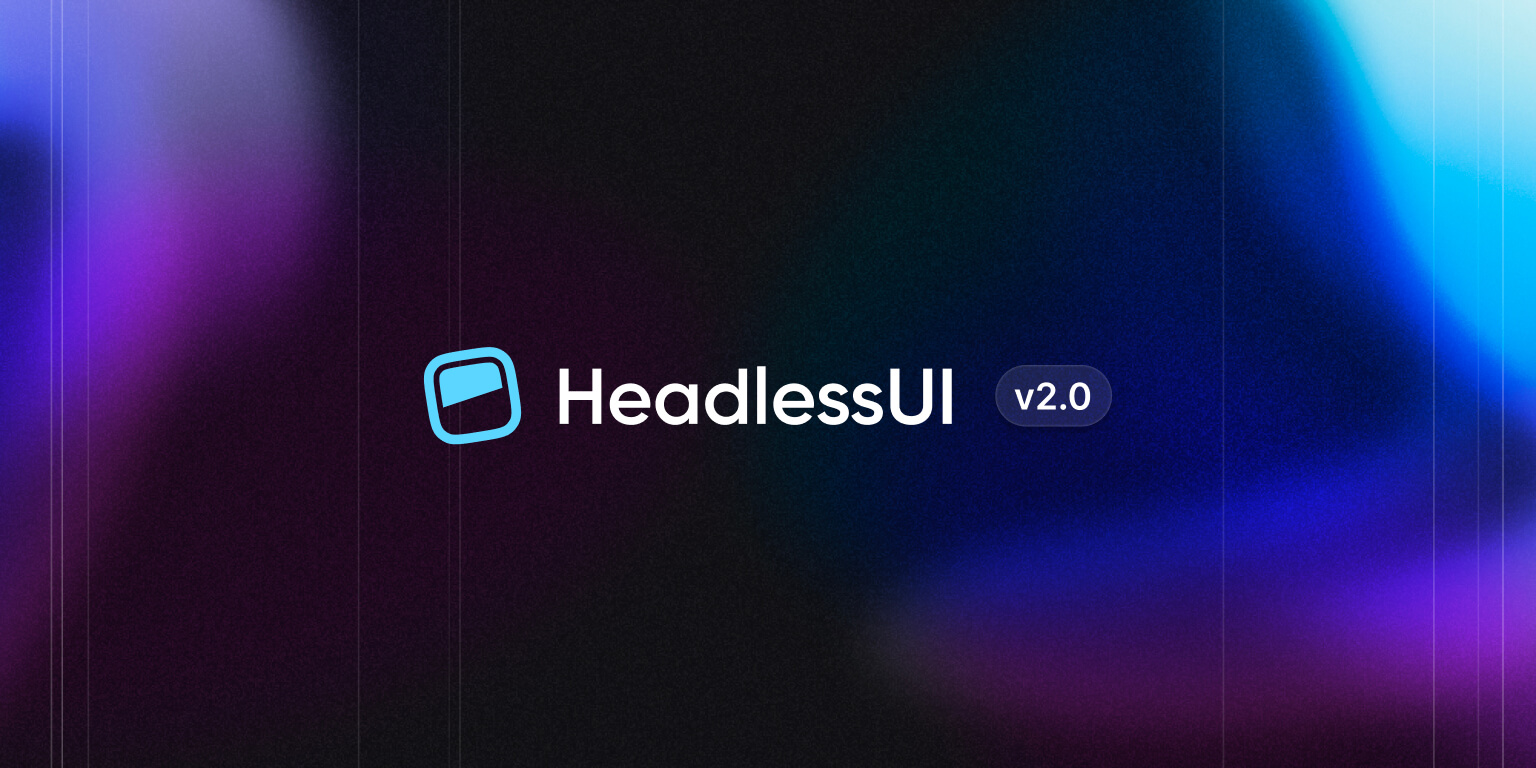
8- Headless UI
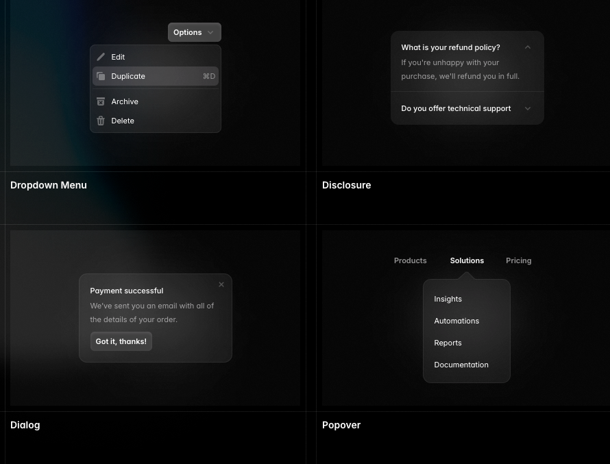
Headless UI is a fully accessible, unstyled UI component library for React and Vue developers. It offers logic-only components, enabling developers to create custom-styled interfaces while managing all necessary accessibility and interaction requirements. This library is particularly valuable for those seeking complete design control without the constraints of predefined styles.
Headless UI is perfect for developers who prioritize design flexibility while adhering to accessibility and interaction standards. It's ideal for creating bespoke user interfaces where appearance control is crucial.
Features:
- Headless Components: Unstyled components that give developers full control over design.
- Accessible: Built with accessibility at its core, ensuring web standard compliance and improved user experience for all.
- React and Vue Support: Compatible with both React and Vue, offering versatility across frameworks.
- Customizable: Flexible integration with any CSS framework, including Tailwind, or custom styles.
- Prebuilt Logic: Handles complex interactions like modals, dropdowns, and dialogs, saving development time.
9- TailFrames
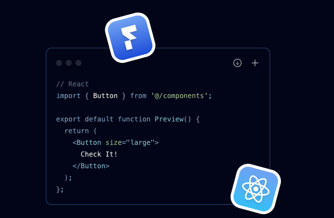
Tailframes is a collection of premium, ready-made Tailwind CSS UI components and templates. Designed to help developers quickly build modern, responsive web applications, it offers a wide range of easily customizable UI components. These can be seamlessly integrated into any project, streamlining the development process and enhancing workflow efficiency.
Tailframes accelerates development by offering a diverse array of professionally designed components and templates. Its ease of customization, responsive design, and Figma integration make it an excellent choice for efficiently building modern web applications.
Features
- Prebuilt UI Components: Offers a large collection of components, including headers, footers, forms, buttons, and more.
- Responsive Design: All components are built with responsiveness in mind, ensuring they work seamlessly across devices.
- Premium Templates: Includes fully designed templates for landing pages, dashboards, and other common layouts.
- Customizable: Built on Tailwind CSS, allowing easy customization and adaptability to fit any project’s design.
- Figma Integration: Comes with Figma design files, enabling designers and developers to collaborate easily.
10- React-daisyUI
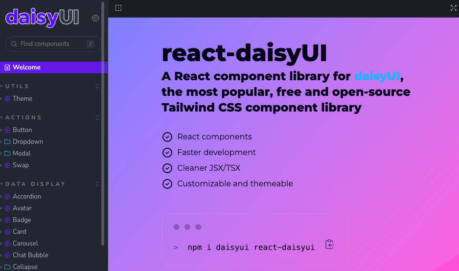
DaisyUI is a UI component library built on top of Tailwind CSS. It's designed to simplify and enhance the process of creating beautiful, responsive interfaces. The React version of DaisyUI integrates smoothly with Tailwind, offering pre-styled, customizable components that work well across various devices.
daisyui11- Tailwind React UI
Tailwind React UI is a library that provides pre-built React components using Tailwind CSS utility classes.
This library allows developers to create custom UIs efficiently while maintaining the flexibility to tailor components to specific project needs. It combines the power of React with the utility-first approach of Tailwind CSS, resulting in a versatile tool for modern web development.
It offers a flexible approach to building user interfaces with the following key features:
- Ready-made components with no built-in styles, leveraging Tailwind CSS classes
- Utility Class Props API for easy customization and prototyping
- Configurable theming system using React context
- Highly composable and accessible components
- Support for PurgeCSS to optimize CSS file size
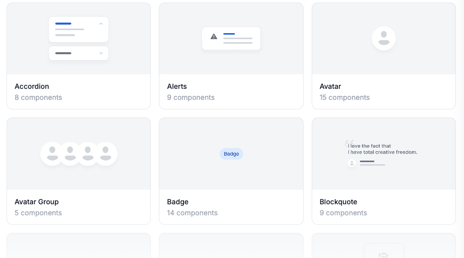
12- Preline UI
Preline is a comprehensive, utility-first CSS component library built on Tailwind CSS. It provides developers with ready-to-use UI components for building modern, responsive web applications. Preline offers a wide range of customizable components and utilities to streamline the development process.
Does It Work with React Apps?
Yes, Preline works seamlessly with React applications. As it's based on Tailwind CSS, you can easily integrate its components and utilities into any React project. Simply apply Tailwind classes and customize them to suit your application's needs.
Preline is an excellent tool for React developers looking for a quick, flexible, and responsive way to build modern UIs with Tailwind.
Features
- Tailwind CSS-Based: Built on top of Tailwind, allowing easy customization using utility classes.
- Responsive Design: All components are optimized for responsiveness, working across devices.
- Wide Component Library: Includes a variety of UI elements like buttons, cards, modals, and navigation bars.
- Dark Mode Support: Built-in support for light and dark themes.
- Accessibility: Designed with accessibility in mind to ensure a better user experience.
- Customizable: Easily tweak components to match the design requirements of your project.
- Lightweight: Optimized for performance with a minimal footprint.
- Extensive Documentation: Detailed guides and documentation for easy integration and customization.
- Grid System: A flexible grid layout system for building complex designs with ease.
htmlstreamofficial13- Tremor React components (For Dashboards)
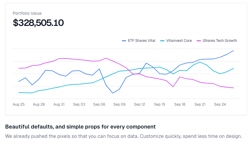
Tremor is a powerful, open-source React library built with Tailwind CSS, designed for creating modern, responsive dashboards and data visualizations. It offers a set of customizable components—including charts, cards, grids, and tables—all optimized for clean, minimalist data presentation.
Tremor stands out for React developers who need a quick, scalable solution for building professional dashboards, with the flexibility of Tailwind and a focus on data-driven UI elements.
Features
- Tailwind Integration: Harnesses Tailwind CSS for effortless customization and rapid styling, enabling developers to prioritize functionality over design.
- Dashboard-Focused Components: Provides ready-to-use elements tailored for dashboard interfaces, such as data charts, metrics displays, and interactive features.
- React-Based: Integrates seamlessly with React, making it perfect for developers working on data-driven applications.
- Responsive and Accessible: Ensures fully responsive and accessible components, guaranteeing dashboards perform well across all devices and accommodate diverse user needs.
Hazem Abbas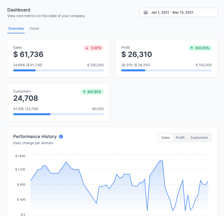
14- Magic UI
Magic UI is a modern component library offering developers a sleek, user-friendly set of pre-built UI elements for creating beautiful, responsive web applications. Its clean, minimalist design is perfect for developers who need to quickly craft visually appealing interfaces.
Why It's Good and Unique for React Developers:
- Tailored for React: Magic UI seamlessly integrates with React, making it ideal for developers using React-based frameworks.
- Minimalistic and Clean: Provides a lightweight and elegant design, reducing styling time for components.
- Customization: Despite its minimalist approach, components are easily adaptable to various project requirements.
- Ease of Use: Magic UI boasts clear documentation and an intuitive API design, enabling quick implementation in projects.
Magic UI distinguishes itself through simplicity, smooth React integration, and versatility. It's an excellent choice for developers aiming to streamline their workflow while creating modern, attractive applications.
Hazem Abbas
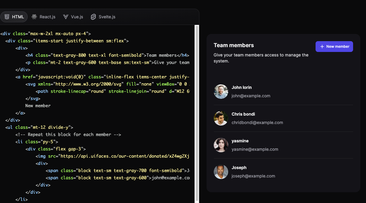
15- HyperUI
HyperUI is a collection of free, open-source Tailwind CSS components that help developers quickly build modern and responsive web interfaces. It provides a wide range of pre-built components—including navigation bars, cards, buttons, and forms—all designed with a clean, minimal aesthetic.
HyperUI aims to speed up web development by offering a library of customizable, ready-to-use components.
JSX Support:
HyperUI components can be used in JSX-based frameworks like React and Next.js by converting the HTML structure to JSX syntax. As the components are styled with Tailwind CSS, you can easily integrate them into your React or Next.js projects using Tailwind classes and adapting the component structure to fit JSX requirements.
This flexibility makes HyperUI a versatile option for developers working with modern JavaScript frameworks.
16- DaisyUI
DaisyUI is a Tailwind CSS-based component library that offers pre-styled, accessible UI components. It enhances Tailwind by adding utility-based components, enabling developers to quickly build attractive interfaces. With DaisyUI, you can easily customize or apply pre-built themes while maintaining Tailwind CSS's flexibility and simplicity.
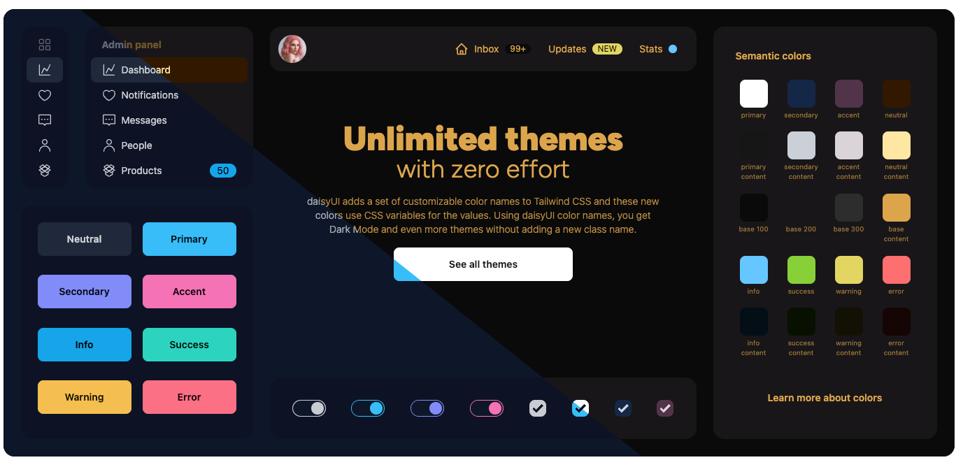
Can It Work with React and Next.js?
Yes, DaisyUI integrates seamlessly with both React and Next.js projects. Since it's built on Tailwind CSS, which is compatible with these frameworks, you can easily incorporate DaisyUI by installing the Tailwind and DaisyUI packages. You can then use the provided components in your React or Next.js applications. This makes DaisyUI an excellent choice for developers who want to accelerate UI development without sacrificing flexibility.
Key Features:
- Tailwind Extension: Adds pre-built, customizable components to Tailwind.
- Component Variety: Offers buttons, forms, alerts, modals, and more.
- Theme Support: Includes multiple built-in themes, with easy custom theme creation.
- Responsive & Accessible: Designed for mobile-friendliness and accessibility best practices.
saadeghi17- MerakiUI
Meraki UI is a Tailwind CSS-based component library that helps developers quickly build modern, responsive web interfaces. It provides a collection of pre-styled, customizable components that seamlessly integrate with Tailwind, simplifying the creation of consistent and visually appealing designs.
Key Features:
- Prebuilt Components: Offers a variety of ready-to-use elements including buttons, forms, modals, and navigation components.
- Tailwind CSS Integration: Built on Tailwind, allowing for easy customization through utility-first classes.
- Responsive Design: Ensures all components are optimized for various screen sizes.
- Ease of Use: Designed for simple integration into any Tailwind project with minimal setup required.
18- React Tailwind Components (Resources)
A hub of most of the generic components used in most of the applications built using React and tailwind-css.
aayush30119- Tailwind Ui Components
This is an easy and ready-to-use Tailwind CSS components for React.
import { Button, Chip, CodeInput, Dropdown, Hint } from "@erfanetoon/react-tailwind-ui";

export default function Example() {
  return (
    <>
      <Button>Button</Button>
      <Chip>Chip</Chip>
      <CodeInput>CodeInput</CodeInput>
      <Dropdown>Dropdown</Dropdown>
      <Hint>Hint</Hint>
    </>
  );
}