Revolutionize Your Workflow: 10 Free Open-Source Tools for Testing Responsive Design


Table of Content
What is a Responsive Design?
Responsive design refers to a web design approach that makes web pages render well on a variety of devices and window or screen sizes.
It provides an optimal viewing and interaction experience—easy reading and navigation with a minimum of resizing, panning, and scrolling—across a wide range of devices (from desktop computer monitors to mobile phones).
Why do you need to test a responsive design?
Testing a responsive design is crucial to ensure that the website or application functions correctly and looks good on all different types of devices, including desktops, tablets, and smartphones.
Each device has its own specifications, and without testing, there could be errors or issues that could harm the user experience. Furthermore, as mobile usage continues to grow, testing responsive design is more important than ever to ensure a consistent experience for all users.
Best open-source tools to test responsive designs
1. Responsivize A must-have tool to develop responsive websites!
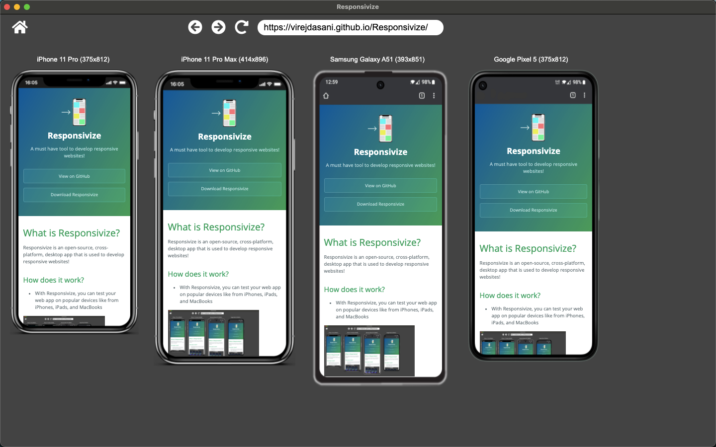
Responsivize is an essential open-source, cross-platform desktop application used for developing responsive websites. It offers the ability to test web applications on various popular devices such as iPhones, Android phones, iPads, and MacBooks.
The app works seamlessly for Windows, Linux and macOS.
Moreover, it provides the option to set custom dimensions for testing, enabling users to test their applications on a variety of screen sizes, from widescreen monitors to smart fridge screens.
It also allows users to enter dimensions or drag the webview for any other unlisted device they want to test in the Custom Size View.
2. Responsively
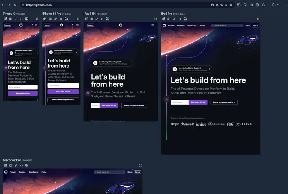
Responsively is a customized web browser specifically built for designers and front-end developers. It allows them to test the responsiveness of their web apps on as many device screens as possible. It comes with dozens of developer-oriented features and powerful browser extensions.
It works for Windows, Linux, and macOS, you can download it from here.
You can read more about it is all over amazing features in our post here.
 Hazem Abbas
3. Responsive Test
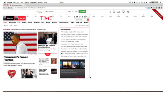
The Responsive Test tool, Originally developed as a web-based project by powered by Nguyen Huu Phuoc. It uses jQuery, Bootstrap 3, and AngularJS, to test responsive layouts and can run directly on a local machine without installation, as all necessary packages are included in the project download.
Although, it is usable, but it did not receive update for years.
4. Responsive Checker
A simple HTML-based tool to test the responsiveness of web pages. You can check a demo version here. This is an old project that hasn't been updated for many years.
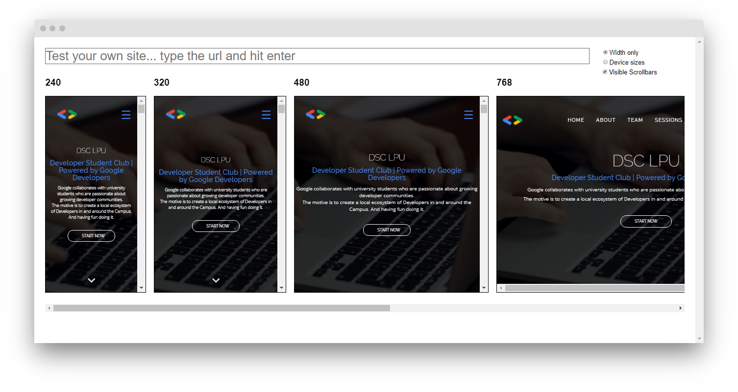
5. Responsive Design Checker
The Responsive Design Checker is an open-source web tool for testing a website's design across multiple screen widths, aiding in the design and building of responsive websites. Users can input their website's URL to test a specific page.
6. Responsive Design Testing
The Responsive Design Testing tool allows for easy testing of website designs in multiple screen widths. Users can test any website and share the link by adding the URL to the end of the testing page address.
The tool is totally free and can be installed on a personal server by copying and uploading certain files, and updating the default URL.
It is important to note that, browser security restrictions prevent navigation of external sites within the iframes.
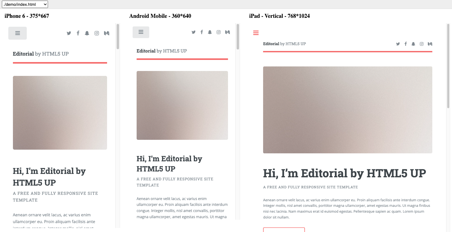
7. Responsive Preview
The is a free and open-source self-hosted tool for previewing responsive applications and websites. The tool offers 13 different device views, auto-scaling to fit screen size, and custom zoom levels. It can be installed globally and used to generate an HTML file for client presentations.
You can check the demo here. To get the source-code you can download it from the Github repo here.
Responsive Design Testing
The Responsive Design Testing is a self-hosted free and open-source tool that allows for easy testing of website designs across multiple screen widths. Users can test any website and share the link.
The tool can be installed on a personal server, with the ability to navigate your website from within the iframes. However, this feature does not work for external sites due to browser security restrictions.
8. Responsive Tester: Google Chrome Extension
The Mobile/Responsive Tester is a must-have extension for Google Chrome that designers and developers can use to test their web designs or mobile pages. It provides the ability to emulate different user agents and screen resolutions, allowing for comprehensive testing against common mobile, phablet, and tablet devices.
This is particularly beneficial for testing responsive web designs, as it ensures that a website or application will render correctly on various platforms. The extension also allows for switching between portrait and landscape modes, and the ability to test multiple mobile devices simultaneously.
This real-time testing on multiple devices can significantly streamline the development process and enhance productivity. To use the extension, simply install it, navigate to the webpage to be tested, click on the extension icon, and then select the desired resolution size.
Overall, the Mobile/Responsive Tester extension is a powerful tool for ensuring optimal user experience across all device types.
You can download it for Google Chrome from here.
9. Responsive Web Design Tool
The Free Responsive Design Tester is a free web tool that allows users to check how their webpage layout behaves at various resolutions.
It's designed to evaluate how a website will look across different devices. By inputting a domain, users can see how their site will be displayed on various platforms. The tester includes specific settings for a 24" desktop (1920x1200), a 23" desktop (1920x1080), a tablet (768x1024), and a mobile device (320x480). This tool is particularly useful for ensuring a website's design is visually appealing and functional across different screen sizes and devices.
10. Using Browser Consoles
Google Chrome and Chromium-based Browsers
To test responsive design with browser consoles in Google Chrome:
- Open the website you want to test.
- Right-click anywhere on the page and select Inspect from the context menu. This will open the Chrome Developer Tools.
- Click on the Toggle Device Toolbar button in the top left corner of the Developer Tools pane. This will show the website as if you were viewing it on a mobile device.
- You can select different devices from the dropdown at the top of the page to see how your website would look on those devices.
Using Mozilla Firefox
To test responsive design with browser consoles in Mozilla Firefox:
- Open the website you want to test.
- Right-click anywhere on the page and select Inspect Element from the context menu. This will open the Firefox Developer Tools.
- Click on the Responsive Design Mode button in the top right corner of the Developer Tools pane. This will show the website as if you were viewing it on a mobile device.
- You can select different devices from the dropdown at the top of the page to see how your website would look on those devices.