

Welcome to an exhaustive list of over 30 data visualization libraries, frameworks, and applications. These tools span across a myriad of platforms and programming languages, providing you with the capability to present complex data in visually appealing and accessible ways.
These solutions cater to a wide range of needs, whether you're dealing with small or large datasets, two-dimensional or three-dimensional data, or static or dynamic data. Each tool has its unique features and functionalities, enabling you to transform raw, complicated data into meaningful, easily understandable visual representations.
The purpose of these data visualization tools is not just to make data visually appealing but also to help you extract valuable insights from the data, thus aiding in decision making and strategy formulation. They can be used across various industries, including technology, healthcare, finance, and marketing, to name a few.
What about Map and Geo Visualization?
If you are looking for an open-source geo visualization libraries and frameworks, we got you covered in the following article: 21 Open Source Free Map Design and Geo Visualization Tools.
 Hazem
Hazem
About this list!
By going through this list, you can explore the diverse range of solutions available, understand their key features, and determine the one that best aligns with your data visualization needs. So, continue reading to explore these various tools, understand their benefits and limitations, and choose the one that best fits your specific requirements.
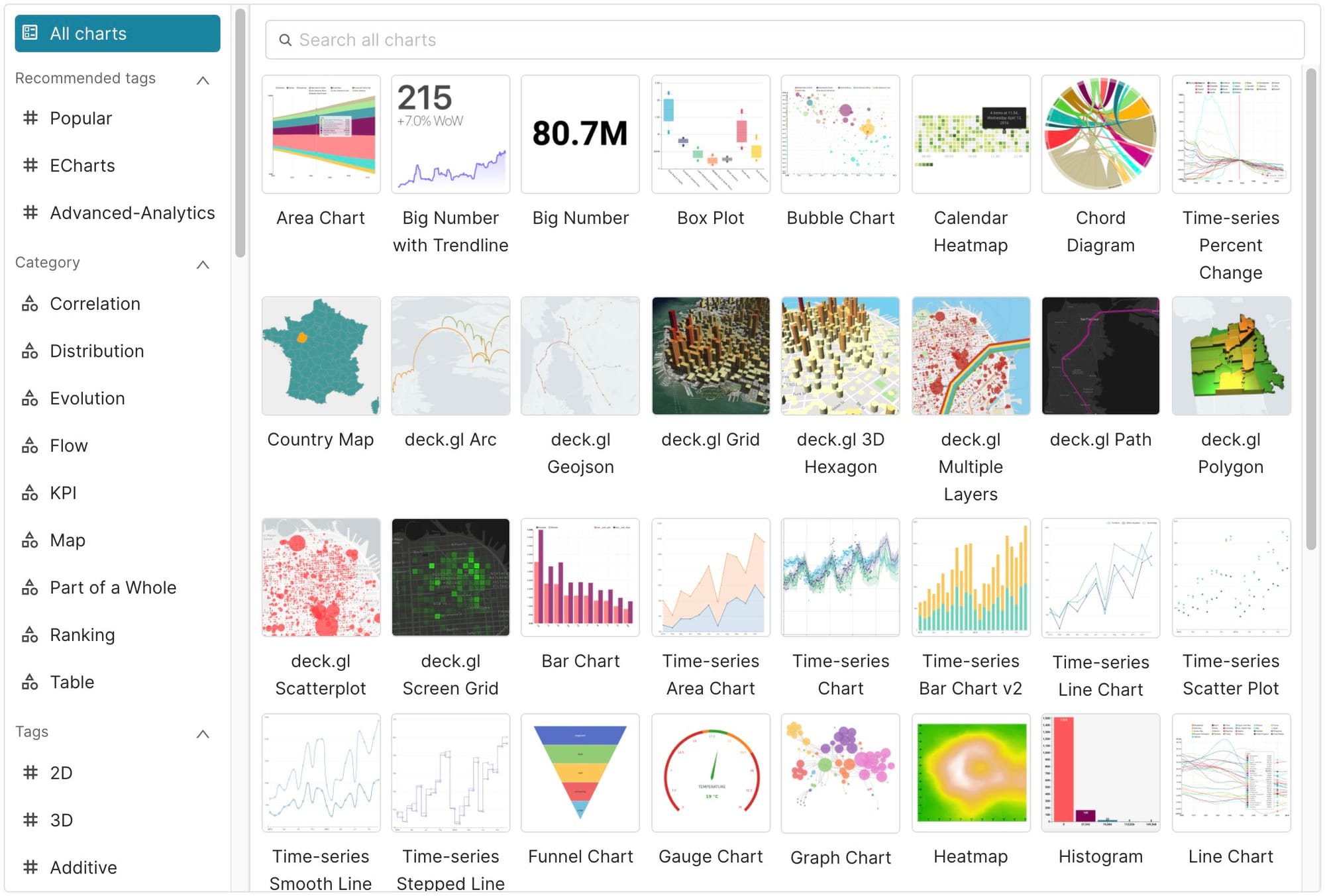
1. Metabase
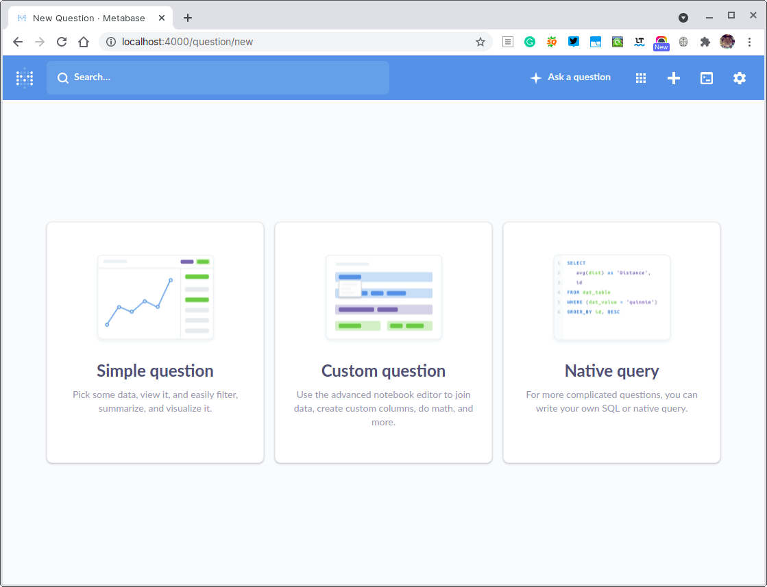
Metabase is a fully integrated data solution that enables data engineers and data scientists to access, manage, browse and visualize their data.
It supports many database and offers a low-code SQL editor that allows anyone to perform complex SQL queries without knowing SQL.
The app also enables anyone to build data-rich applications and dashboards, filled with rich visualizations such as charts, maps, and more.
Hazem
 metabase
2. Gephi - The Open Graph Viz Platform
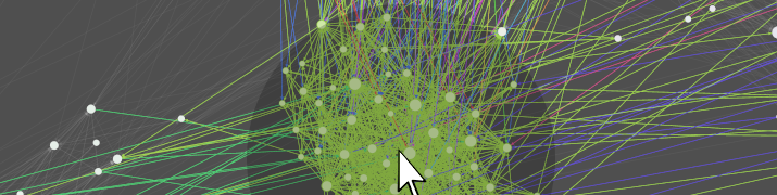
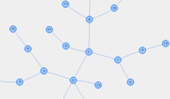
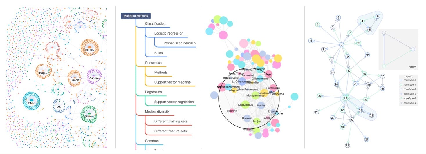
Gephi is an award-winning, open-source platform for visualizing and manipulating large graphs, capable of handling networks up to a million elements.
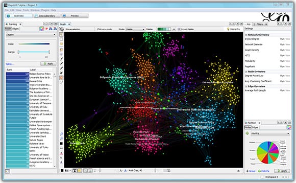
It is available in multiple languages and runs on Windows, Mac OS X, and Linux. It features a user-friendly interface and can be extended with plug-ins, thanks to its architecture built on the Apache Netbeans Platform.
gephi3. Grafana
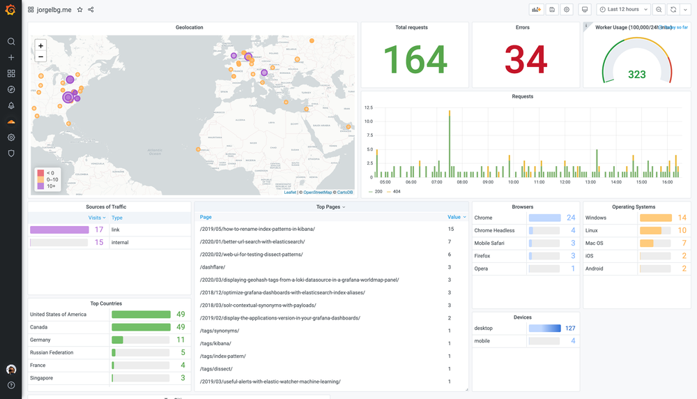
Grafana is an open and composable observability and data visualization platform that supports multiple data sources. It allows querying, visualizing, alerting on, and understanding metrics, fostering a data-driven culture.
Its features include fast and flexible client-side graphs, panel plugins for various visualization options, and dynamic, reusable dashboards with template variables.
grafana4. Kepler.gl
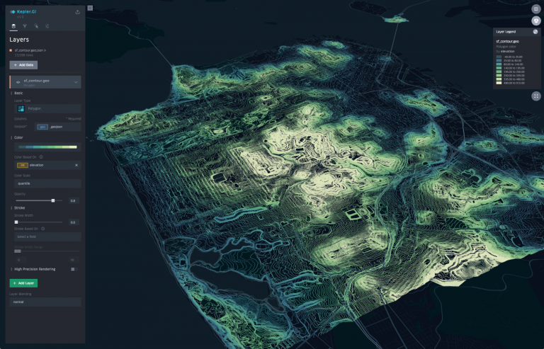
Kepler.gl is an open-source tool to visualize and analyze massive geospatial datasets. It is a high-performance, web-based application for visual exploration of large-scale geolocation data sets. It can render millions of points and perform spatial aggregations.
As a React component using Redux, it can be embedded into other React-Redux applications and is highly customizable.
keplergl5. D3
D3.js is an open-source JavaScript library for creating interactive data visualizations in web browsers, using SVG, HTML5, and CSS standards. It offers great flexibility and control over the final visual result, allowing you to bind arbitrary data to a Document Object Model (DOM) and apply data-driven transformations.
Its emphasis on web standards ensures compatibility with modern browsers without the need for a proprietary framework.
 d3
d36. Plotly.js
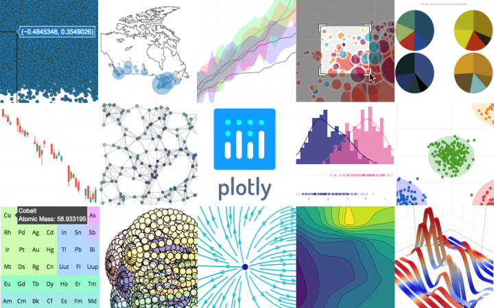
Plotly.js is a standalone Javascript data visualization library, and it also powers the Python and R modules named plotly in those respective ecosystems (referred to as Plotly.py and Plotly.R).
Plotly.js can be used to produce dozens of chart types and visualizations, including statistical charts, 3D graphs, scientific charts, SVG and tile maps, financial charts and more.
plotly7. Apache ECharts
Apache ECharts is a free, powerful charting and visualization library offering easy ways to add intuitive, interactive, and highly customizable charts to your commercial products. It is written in pure JavaScript and based on zrender, which is a whole new lightweight canvas library.
 apache
8. Apache Superset
The Apache Superset is a modern data exploration and data visualization platform. Superset can replace or augment proprietary business intelligence tools for many teams. Superset integrates well with a variety of data sources.
apacheHazem
9. PixiJS
PixiJS is a fast, lightweight 2D library designed to work across all devices, offering the power of hardware acceleration without requiring prior knowledge of WebGL. It is ideal for creating rich, interactive graphics and cross-platform applications and games.
PixiJS supports WebGPU with fallback support for WebGL, and provides out-of-the-box cross-platform compatibility and graceful degradation.
Features
- WebGL renderer (with automatic smart batching, allowing for REALLY fast performance)
- WebGPU renderer (new to the latest browsers!)
- Canvas renderer (Fastest in town!)
- Full scene graph
- Super easy to use API (similar to the flash display list API)
- Support for texture atlases
- Asset loader / sprite sheet loader
- Auto-detect which renderer should be used
- Full Mouse and Multi-touch Interaction
- Text
- BitmapFont text
- Multiline Text
- Render Texture
- Primitive Drawing
- Masking
- Filters
- Offers dozens of community supported plugins
pixijs10. Graphviz
Graphviz is an open-source graph visualization software used in various fields like networking, bioinformatics, software engineering, and more. It takes graph descriptions in a simple text language and creates diagrams in multiple formats such as images, SVG, PDF, or Postscript.
It offers various features like color options, fonts, tabular node layouts, line styles, hyperlinks, and custom shapes.
 The Graphviz Authors
11. Streamlit
Streamlit is a tool that transforms Python scripts into interactive web apps quickly, allowing for the creation of dashboards, reports, or chat apps. It offers live editing and fast prototyping, and is both open-source and free, encouraging community contribution.
It supports many layouts, rich complex datasets and dataframes, comes with many input widgets, and allows for complex multiple data-oriented apps.
Recommended for:
- Data engineers
- Data analytics engineers
- Data scientists
- Python developers
streamlit12. Dash
Dash is a widely used Python framework for creating machine learning and data science web applications. It integrates modern UI elements with Python analytical code, using Plotly.js, React, and Flask.
Dash Open Source allows for local app development, while Dash Enterprise provides scalable hosting, deployment, and authentication for wider consumption.
plotly13. RAWGraphs
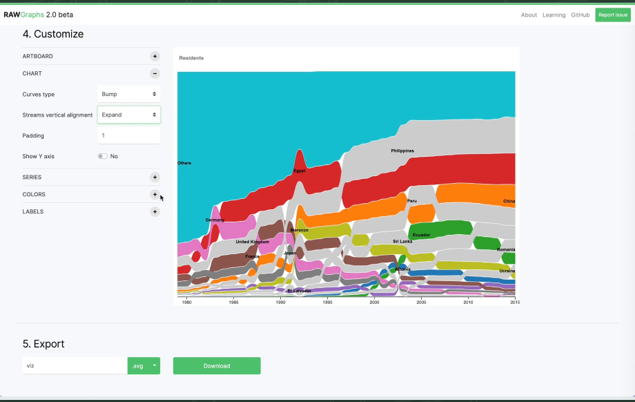
RAWGraphs is a low-code open-source awesome visualization toolset for creating a beautiful visualization and graphs.

14. visx (React)
visx is a collection of low-level visualization primitives for React developed by Airbnb. It offers advantages such as minimized bundle sizes, flexibility with state management, animation libraries, or CSS-in-JS solutions, and it does not impose its own charting library.
Essentially, if you know React, you can create visualizations using familiar APIs and patterns with visx.
airbnb15. Charted
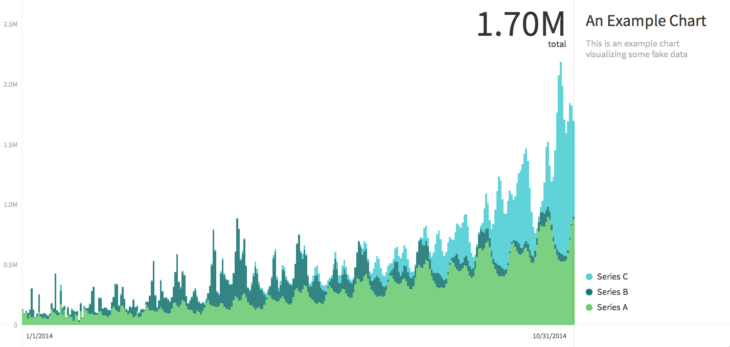
Charted is a tool for automatically visualizing data, offering features such as rendering well on all screen sizes, updating charts every 30 minutes, and adjusting chart types and labels. It supports .csv files, .tsv files, Google Spreadsheets, and Dropbox share links to supported files.
charted-co16. vis.js Community Edition
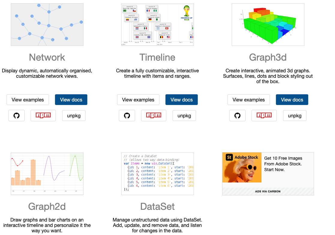
Vis.js is a dynamic, browser-based visualization library designed for ease of use, handling large amounts of dynamic data, and enabling data manipulation and interaction.
It comprises components such as DataSet, Timeline, Network, Graph2d, and Graph3d. It allows for the creation of customizable, interactive network views and timelines.

17. Billboard.js
Billboard.js is a chart library that offers a simple way to instantly create charts. The name "billboard" is inspired by the well-known "billboard chart".
naver18. Datashader
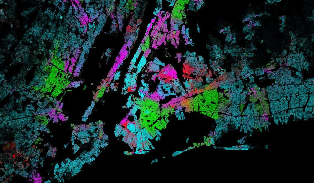
Datashader is a data rasterization pipeline that automates the process of creating representations of large data sets. It operates in three main steps: projection, aggregation, and transformation.
It is designed for performance and scalability, and can be used alone or as a pre-processing stage in a plotting library. It supports Python 3.8 to 3.11 on Linux, Windows, and Mac.
19. Heatmap.js
Heatmap.js is an open-source JavaScript library that enables developers to add a heatmap visualization to their apps in matter of mins.
20. Geemap
Geemap is a Python package for interactive geospatial analysis and visualization with Google Earth Engine. It is open-source and licensed under MIT.
The project is supported by NASA under Grant No. 80NSSC22K1742. It offers extensive resources including documentation, a GitHub repository, and tutorial videos on YouTube.
Features
- Convert Earth Engine JavaScripts to Python scripts and Jupyter notebooks.
- Display Earth Engine data layers for interactive mapping.
- Support Earth Engine JavaScript API-styled functions in Python, such as Map.addLayer(), Map.setCenter(), Map.centerObject(), Map.setOptions().
- Create split-panel maps with Earth Engine data.
- Retrieve Earth Engine data interactively using the Inspector Tool.
- Interactive plotting of Earth Engine data by simply clicking on the map.
- Convert data format between GeoJSON and Earth Engine.
- Use drawing tools to interact with Earth Engine data.
- Use shapefiles with Earth Engine without having to upload data to one's GEE account.
- Export Earth Engine FeatureCollection to other formats (i.e., shp, csv, json, kml, kmz).
- Export Earth Engine Image and ImageCollection as GeoTIFF.
- Extract pixels from an Earth Engine Image into a 3D numpy array.
- Calculate zonal statistics by group.
- Add a customized legend for Earth Engine data.
- Convert Earth Engine JavaScripts to Python code directly within Jupyter notebook.
- Add animated text to GIF images generated from Earth Engine data.
- Add colorbar and images to GIF animations generated from Earth Engine data.
- Create Landsat timelapse animations with animated text using Earth Engine.
- Search places and datasets from Earth Engine Data Catalog.
- Use timeseries inspector to visualize landscape changes over time.
- Export Earth Engine maps as HTML files and PNG images.
- Search Earth Engine API documentation within Jupyter notebooks.
- Import Earth Engine assets from personal account.
- Publish interactive GEE maps directly within Jupyter notebook.
- Add local raster datasets (e.g., GeoTIFF) to the map.
- Perform image classification and accuracy assessment.
- Extract pixel values interactively and export as shapefile and csv.
gee-community21. Panel

Panel is an open-source Python library designed for building powerful tools, dashboards, and complex applications. It incorporates the PyData ecosystem and data tables, offering both high-level reactive APIs and lower-level callback based APIs. It is part of the HoloViz ecosystem, a connected network of data exploration tools.
Panel provides a unique combination of deployment options. You can share your data and models as
- a web application running on the Tornado (default), Flask, Django or Fast API web server.
- a stand alone client side application powered by Pyodide or PyScript via
panel convert. - an interactive Jupyter notebook component.
- a static
.htmlweb page, a.gifvideo, a.pngimage and more.
Panel works really well with the visualization tools you already know and love like Altair/ Vega, Bokeh, Datashader, Deck.gl/ pydeck, Echarts/ pyecharts, Folium, HoloViews, hvPlot, plotnine, Matplotlib, Plotly, PyVista/ VTK, Seaborn and more. Panel also works with the ipywidgets ecosystem.
Hazem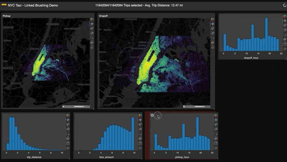 holoviz
22. Mozaïk
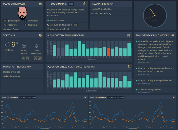
Mozaïk is a nodejs/react/redux/d3 based tool designed for crafting beautiful dashboards. It features a scalable layout, theme support, module extendability, grid positioning, optimized backend communication, and rotation support with smooth transition.
ploucHazem
23. JSON Crack
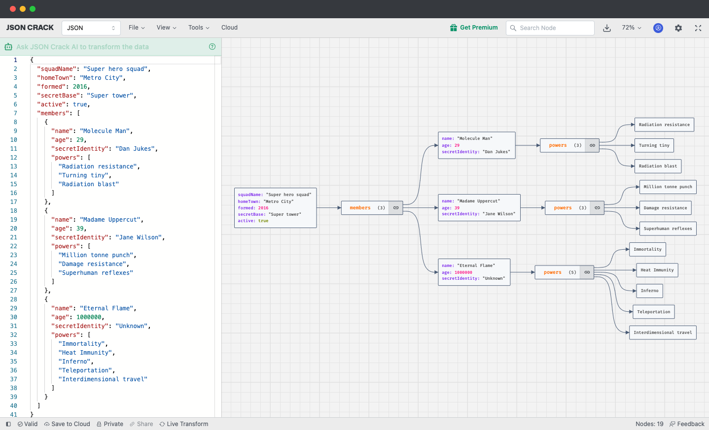
JSON Crack is a free, open-source data visualization app that can transform various data formats into interactive graphs. Its user-friendly interface simplifies the exploration and analysis of complex data structures, making it a useful tool for developers and data enthusiasts.
Features
- Dark mode.
- Graph & Tree view modes.
- Transform & filter data with AI.
- Export to PNG, SVG, JPEG & clipboard.
- Zoom and panning support with touch gestures.
- Supports data formats like JSON, YAML, CSV, XML, TOML...
- JQ, JSON Schema, Decode JWT, Generate Types and interfaces.
- Wide range of tools - search graph, json path, validate, save to cloud...
- Embeddable iframe widgets.
AykutSarac24. ReDash
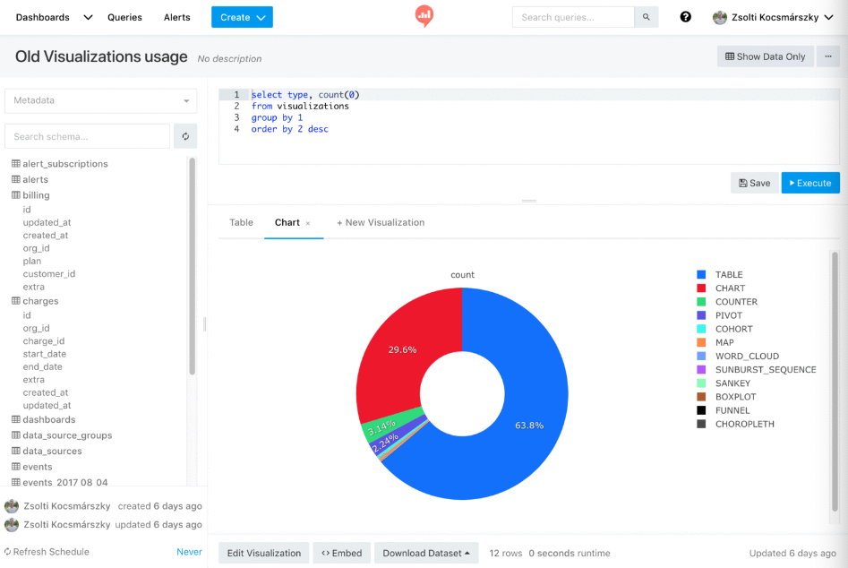
Redash is a free open-source project that empowers users of all technical levels to utilize data, big and small. It allows SQL users to explore, query, visualize, and share data from any source, enabling data-driven decision-making within their organizations. It is used daily by millions of users at thousands of organizations worldwide.
Features
- Browser-based: Everything in your browser, with a shareable URL.
- Ease-of-use: Become immediately productive with data without the need to master complex software.
- Query editor: Quickly compose SQL and NoSQL queries with a schema browser and auto-complete.
- Visualization and dashboards: Create beautiful visualizations with drag and drop, and combine them into a single dashboard.
- Sharing: Collaborate easily by sharing visualizations and their associated queries, enabling peer review of reports and queries.
- Schedule refreshes: Automatically update your charts and dashboards at regular intervals you define.
- Alerts: Define conditions and be alerted instantly when your data changes.
- REST API: Everything that can be done in the UI is also available through REST API.
- Broad support for data sources: Extensible data source API with native support for a long list of common databases and platforms.
getredash25. Bokeh
Bokeh is an interactive visualization library for modern web browsers, offering elegant construction of versatile graphics and high-performance interactivity for large or streaming datasets. It is ideal for creating interactive plots, dashboards, and data applications swiftly and conveniently.
bokeh26. G2
G2 is a visualization grammar for dashboard building, data exploration and storytelling.
Features
- Progressive Usage - The main objective of G2 is to help you get meaningful visualizations quickly with concise declarations and it infers the rest. But you can configure much more for complex and advanced situations.
- Declarative API - We employs a functional declarative API to specify chart options in a programmatic fashion, which contributes to better logic reuse and more flexible code organization.
- High Extensibility - To satisfy specific needs, G2 provides a convenient and consistent mechanism to extend everything you can imagine, whether a scale, a transform, a mark, etc,. You can even customize a brand new visualization tool based on this mechanism.
- Comprehensive Grammar - G2 rejects a chart typology in favor of marks, transforms, scales, coordinates, and compositions. In addition to static visual representations, it's possible to declare data-driven animations and apply well-designed action-based interactions to plots as well.
- Powerful Renderer - There is a powerful renderer G under G2 to generate web-based visualizations using Canvas, SVG or WebGL. The plenty of plugins it has benefit G2 from rendering charts with novel styles such as hand-drawn and fully embracing the ecosystem of D3.
antvis27. G6
G6 is a graph visualization engine. It provides basic capabilities for graph visualization and analysis such as drawing, layout, analysis, interaction, animation, themes, and plugins.
With G6, users can quickly build their own graph visualization and analysis applications, making relational data simple, transparent, and meaningful.
antvis28. PyGWalker
PyGWalker is a tool that integrates Jupyter Notebook with Graphic Walker, an open-source alternative to Tableau, to simplify data analysis and visualization.
It transforms pandas dataframes into an interactive user interface for visual exploration, allowing data scientists to visualize, clean, and annotate data with simple drag-and-drop operations and natural language queries.
Kanaries29. Open3D
Open3D is an open-source library for 3D data software development, offering optimized and parallelizable backend, and data structures and algorithms in C++ and Python.
It features 3D data structures and processing algorithms, scene reconstruction, surface alignment, 3D visualization, physically based rendering, 3D machine learning support with PyTorch and TensorFlow, and GPU acceleration for core 3D operations.
Features
- 3D data structures
- 3D data processing algorithms
- Scene reconstruction
- Surface alignment
- 3D visualization
- Physically based rendering (PBR)
- 3D machine learning support with PyTorch and TensorFlow
- GPU acceleration for core 3D operations
- Available in C++ and Python
isl-org30. tmap
The tmap is a fast visualization library for large, high-dimensional data sets, available for Python, with graph layouts based on the OGDF library.
31. PlotJuggler
PlotJuggler is a fast, powerful, and intuitive tool for visualizing time series. It offers features such as a simple drag & drop interface, data loading from files, live data streaming, saving visualization layouts, fast OpenGL visualization, handling thousands of timeseries and millions of data points, data transformation, and extensibility through plugins.
Data Sources
- Load CSV files.
- Load ULog (PX4).
- Subscribe to many different streaming sources: MQTT, WebSockets, ZeroMQ, UDP, etc.
- Understand data formats such as JSON, CBOR, BSON, Message Pack, etc.
- Well integrated with ROS: open rosbags and/or subscribe to ROS topics (both ROS1 and ROS2).
- Supports the Lab Streaming Layer, that is used by many devices.
- Easily add your custom data source and/or formats...
facontidavide32. Kyrix
Kyrix is a tool that aids in creating data visualizations with details-on-demand interactions, such as pan and zoom. It is designed to handle large datasets, focusing on providing a usable declarative API library for developers and ensuring a 500ms response time for user interactions to facilitate interactive browsing.
tracyhenry33. Netdata
Netdata is a real-time, high-resolution monitoring and visualization tool for servers, containers, and applications. It presents metrics in low-latency dashboards and can run on physical and virtual servers, cloud deployments, Kubernetes clusters, and edge/IoT devices.
It scales from a single server to thousands, even in complex cloud environments, and can store metrics for years given enough disk space.
Hazem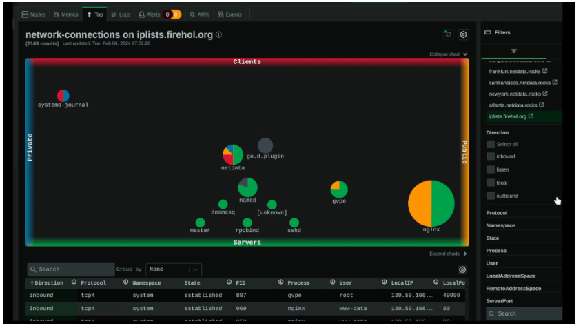 netdata